M365 Fake Data Generator (and data migration)
A tool that turns empty M365 dev tenants into vibrant, realistic environments by generating users, fake files, emails, and activity. Instead of testing on lifeless shells, you get a tenant that behaves like a real one, credible and demo-ready. Bonus: it can migrate data between users when needed!


When we build or test a solution involving M365, we (thankfully!) don’t touch production data. Instead, we use Microsoft’s dev tenants, safer and smarter.
These tenants are great on paper: Exchange, OneDrive, SharePoint, Teams... all ready to go.
Well, almost ready, because out of the box, they’re just empty shells: No files, no folders, no emails, no Teams. Nothing...
And that’s where the pain kicks in: populating the tenant with realistic data that mirrors actual usage, both in quantity and structure.
Because let’s face it, a lifeless tenant doesn’t tell you much when you’re trying to validate a solution. It’s like test-driving a car with no engine.
I’ve already shared some handy scripts to automatically populate a M365 tenant with data, and that’s a solid start. But hey, why stop there? Let’s kick it up a notch and make that demo tenant feel truly alive, like it’s been buzzing for months! Fake users, real-world patterns, and just the right amount of organized chaos... all prepped and ready at the push of a button!
One ring to rule them all, one ring to find them,
One ring to bring them all, and in the darkness bind them...

… And here it is, the ring in our story: a powerful tool forged to unite all scripts in one place, binding them into a single flow to manage data creation across every corner of your M365 tenant.
It feeds Exchange, SharePoint, OneDrive, and Teams with realistic, structured data. You get full control over variability, scale, and timing, so your demo or dev tenant doesn’t just look alive… it feels alive.
I give it to you, my fellow tech aficionados, your precious is here:
🚨 Click here to show access and credentials 🚨
https://m365generator.point4.fr
login : GregHSH
Password : Bilbothehobbit
And as a Bonus: no more choking your internet line with endless uploads or scripts gone rogue. This tool runs in the cloud, feeds your M365 tenant smartly and efficiently, and lets you focus on what really matters: building, testing, and impressing your customers.
Enjoy, and may your demo tenants never be empty again! 🙏
HOW DOES IT WORK?
First of all, every connection runs in its own secure context, so whatever you do with the tool stays yours. Your tenant, your data, your operations. No shared sessions, no cross-tenant mix-ups, and definitely no unwanted surprises.
Privacy and isolation are baked in from the start.
Each user's session has it's own persistent UID stored in the browser's local storage, and it's verified with every action a user can perform. No UID = No actions.
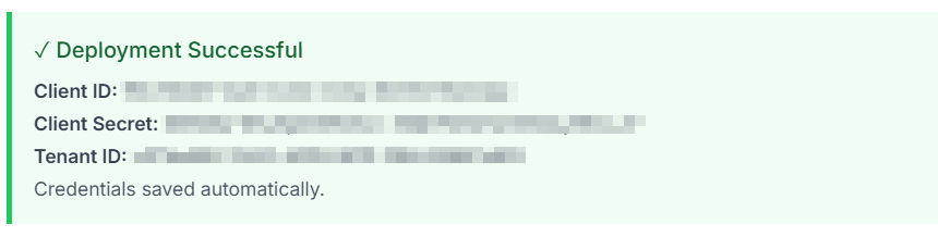
1/ To get started, head to the "Setup & Deploy" tab and deploy the Enterprise Application.
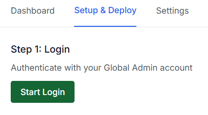
Login via device code flow using your Microsoft 365 Global Admin account.
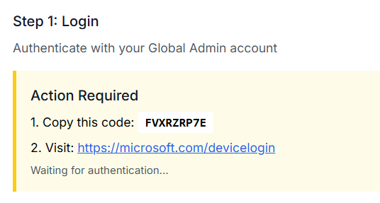
Deploy the Enterprise Application (this will register the required Azure App in your tenant and grant it the necessary Graph permissions).
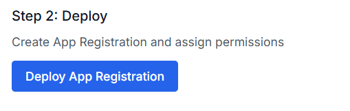
if everything went smoothly, you should see a confirmation that looks like this
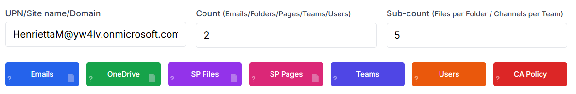
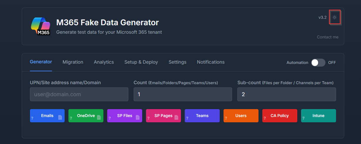
2/ Once your app is deployed, it’s showtime!
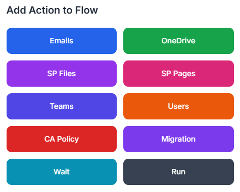
From the main dashboard, you’ve got the power to breathe life into every corner of your tenant. Here’s what you can spawn with a few clicks:
- Exchange → Fake emails with attachments, straight to the inbox
- OneDrive → Auto-filled with folders and randomly sized files
- SharePoint → Load up with documents or create slick modern pages
- Teams → Generate teams with channels ready for "collaboration"
- Conditional Access Policies → Add realistic security rules to spice things up
- Users → Create users packed with properties: names, countries, licenses, and more
It’s like building your own corporate sim, minus the meetings. 😉
The logic is the following:
In the 1st field, enter the target, either a user’s UPN (for Exchange, OneDrive, etc.) or a SharePoint site name.
In the 2nd field (Count), set the main quantity, like the number of emails, folders, or pages.
Some services need a bit more detail, enter a 3rd field (Sub-count) when required.
Count = number of folders
Sub-count = number of files per folder
Then just hit the button for the type of data you want to generate, and et voila, off it goes.
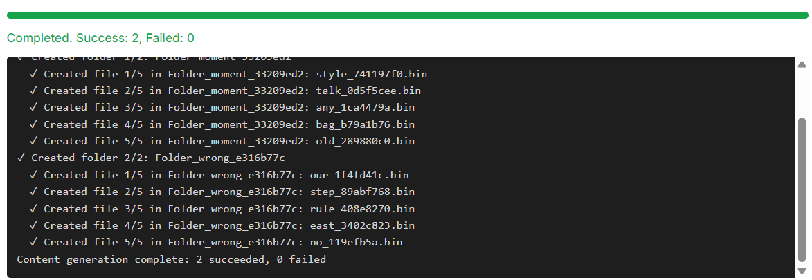
You’ll be taken to a live log screen, where you can watch twhat happen in real time: every action, every file, every user being created is logged so you know exactly what’s going on behind the scenes.
3/ Bonus round : want to scale it up for multiple users?
Look to the right of each button, you’ll spot a little 📄 icon.
That’s your gateway to CSV-powered generation!
Click it to upload a CSV file as the input for your job. Each row becomes a target (user or site), and the script will create data based on the quantity you’ve defined in Count and Sub-count fields.
That’s your golden ticket to unleash an army of users.
To handle multiple users and heavy API loads, the tool automatically manages token re-authentication, throttling (429 errors), and retries.
4/ The specific case of mass email creation
My first attempt was to tried using an email creation component to build the body, subject, and sender, then fire it off via SMTP to the target mailbox.
Yeah… not my brightest idea. 😅
After a few hundred emails, Microsoft politely (read: aggressively) blacklisted my IP as a spammer.
Fair enough, I guess. Lesson learned the hard way!
I looked into whether I could whitelist my IP for my M365 tenant, turns out, nope. The SMTP filtering is global, sitting above my tenant, and there’s no way around it.
So… how do you get thousands of emails into an inbox without triggering the spam alarms?
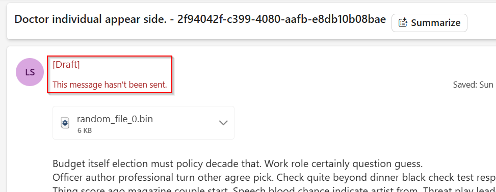
Just change the game: instead of sending the emails, I just build them directly into the destination mailbox’s inbox.
That’s exactly what this script does, it creates a new mail item with a sender, subject, body, and optional attributes (like read/unread status), and drops it straight into the inbox.
That’s why these emails are marked as drafts, they’re not really sent, just teleported in.
5/ Boost the power : automate it, orchestrate it.
Now let’s flip the switch, automation is ON!

It’s time to feed your M365 tenant with realistic, lively data tailored exactly to your needs. From users to emails, folders to Teams channels, every asset comes with just the right amount of variability to feel authentic.
This setup delivers a fully-loaded, demo-ready tenant in a single click.
One button, infinite possibilities.
Let the data party begin!
It works with cards, each tied to a specific data type, Email, OneDrive, SharePoint, and more.
Stack them up, and they form a chain, a flow of actions that runs automatically, step by step. Like dominoes, but way more productive!
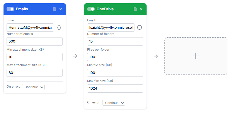
Once everything’s in place and your flow is ready to roll, just drop in a "Run" card at the end.
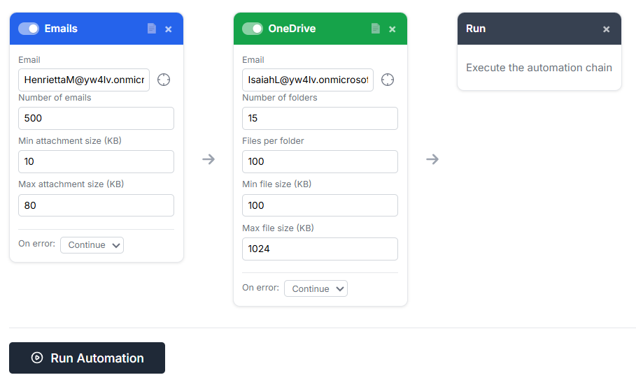
A shiny Run Automation button appears, click it, and your entire flow springs into action, executing each step like clockwork. Sit back, relax, and watch your tenant come alive, one piece at a time. 🧩🧩🧩
Special cases: some cards come with a twist.
Here’s one of those fun-but-tricky scenarios:
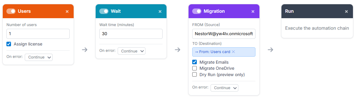
Let’s say I want to create 25 users in Entra ID. Easy, I drop a "Users" card into the flow.
Now, I also want these users to get a mailbox. No problem! I tick the "Assign license" checkbox, and boom, each user gets an M365 license and therefore a mailbox. So far, so good.
But then comes the cool part: feeding those fresh new mailboxes with data.
And here's the catch: the users are randomly generated, so I won’t know their email addresses until the user creation step has actually run.
So how do we solve that? 🤔
That’s where orchestration shines, by chaining cards in sequence and letting the tool pass context between them. Once the users are created, their details can be used as dynamic input for the next card, like injecting emails into their inboxes automatically.
How to do that? Easy. 😎
Just drag the little crosshair icon next to the email field and drop it onto the Users card.
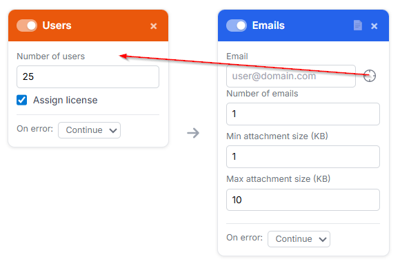
Boom, your Email card is now linked, and it will automatically grab the email addresses of the freshly created users.
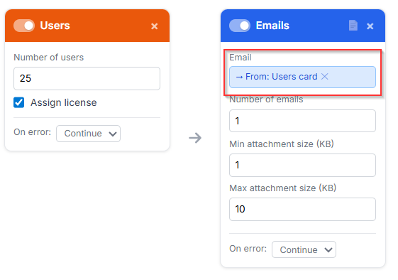
No need to guess or hardcode anything, the flow does the heavy lifting and wires it all up dynamically.
Super satisfying, right?
Wait, wait, wait… but Greg, the automation failed!? 😱
Yes, because we create the 25 users, super fast...
Then assign the M365 licenses, still fast...
And then we try to generate emails for their mailboxes... but Azure’s not in a rush.
It can take up to 30 minutes to fully provision those mailboxes.
No stress, Azure’s on its own schedule! 😅
all the creation tasks are async, so I can run multiple API calls at the same time without waiting for Azure to respond one by one.
That's one way to speed up item creation.
(Except for OneDrive migration, I’ll explain why in the migration section.)
How do we solve that?
Simple, just drop in a "Waiting" card to pause the flow and give Azure the time it needs. Once the wait is over, the workflow picks right back up with the next card.
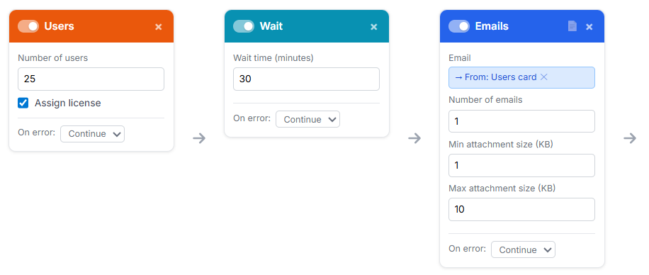
And there it is, a clean, seamless workflow that creates users and fills their mailboxes right after!
Match your data patterns
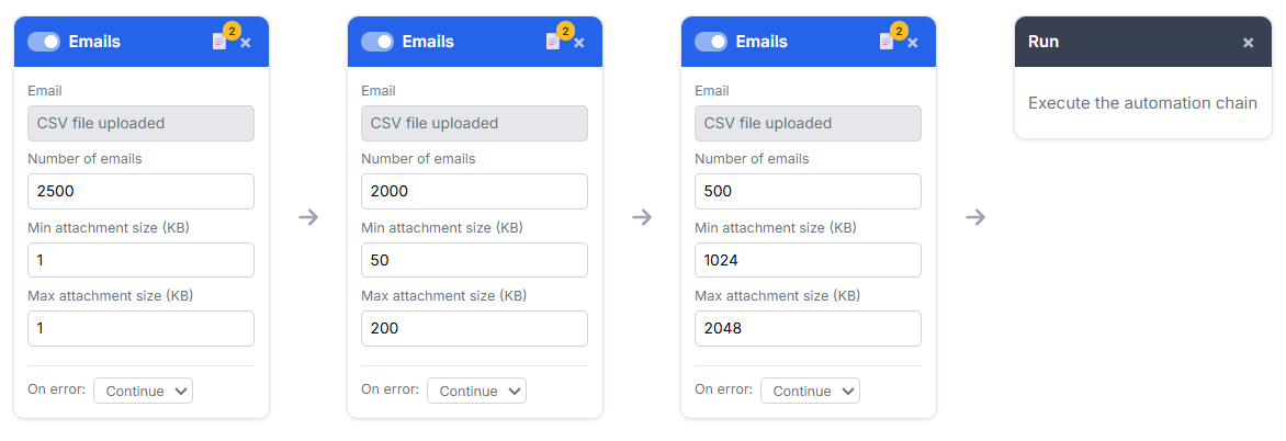
Sometimes you need to test a very specific scenario.
For example: “I want a mailbox with 5000 emails, where 50% have tiny attachments (1KB), 40% are medium (50KB–200KB), and 10% are chunky (1024KB–2048KB).”
Easy peasy, my friend, just use automation to stack the same card multiple times, each with a different data pattern.
One for the small files, one for the medium, one for the big boys.
Chain them together,
Migration between users
It could happen that you just need to clone one user's data to another, clean and simple. That’s where the Carbon Copy feature kicks in: Migration.
Pick a source, choose your target, and boom, data duplication without the manual mess.
It’s like Ctrl+C, Ctrl+V... but for M365.
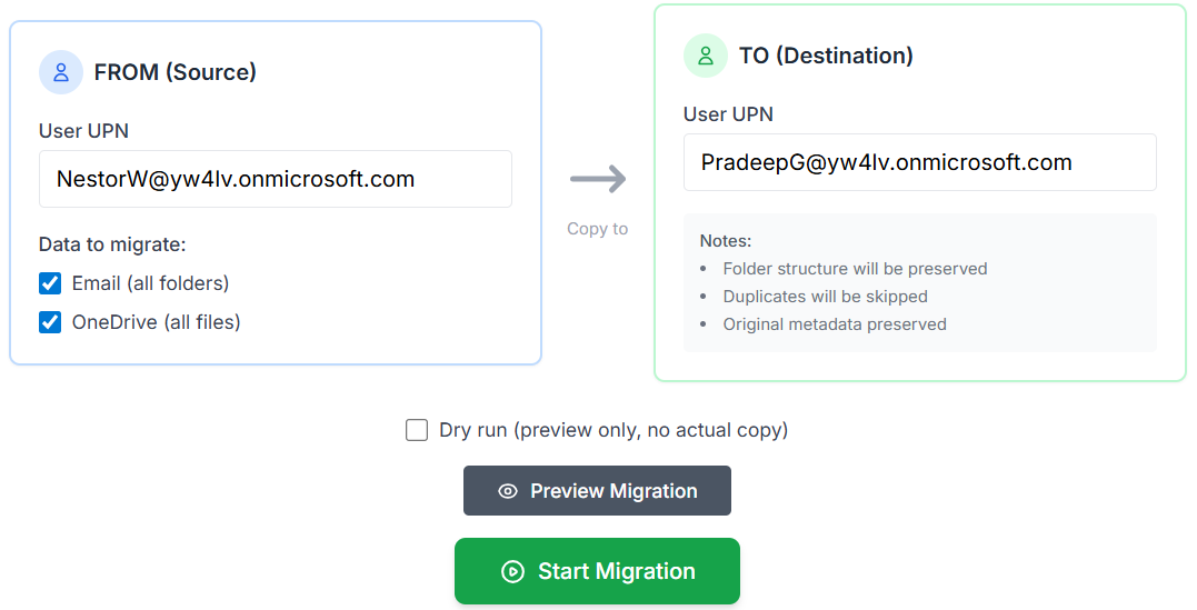
Hit the Preview Migration button to get a sneak peek at the source dataset, make sure everything looks just right.
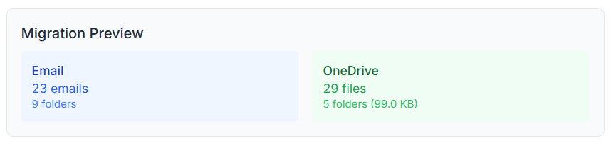
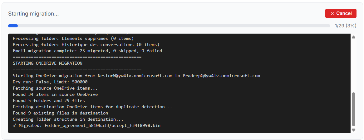
For Exchange, I use the new mail import/export feature in the Microsoft Graph API (still in beta).
Emails are imported in batches of 20 for better performance.
For OneDrive, I use MS Graph's delta query to fetch all items in a single paginated request (instead of going through each folder recursively).
Because of the limited memory on the current server, file uploads are done sequentially instead of in batches. It’s slower, but more stable for memory management, especially since some files can be quite large.
Feeling confident? Smash that Start Migration button!
Still a bit hesitant? No worries, run a Dry Run first to double-check everything without touching a byte.
Better safe, then sorry!
It’s also available as a card in the Automation Flow Builder, so you can easily chain it with other actions, like creating users.
et voilà! A perfectly balanced mailbox that hits your test case like a pro!
12/05 Bonus Update: Analytics !
This weekend, I dropped a shiny new feature into the tool: Analytics!
You can now pull real metrics straight from your M365 tenant to get a clear, real-life snapshot of your data, who’s got what, how much, and where.
No more guessing, just insights, loud and clear!
You'll find a new tab called "Analytics" :

To make it work, you’ll need to delete the existing enterprise app using the "Delete" button in the "Settings" tab, then redeploy a new app through the "Setup & Deploy" tab.
I’ve set a limit here, because let’s be honest, this feature can be a bit of an API beast, and my humble backend server isn’t exactly running on Azure steroids !😅
So for now, your tenant must have 1000 users max to use the Analytics feature.
That why the first step would be to check if the tenant can have access to Analytics by clicking on this button.

Once everything’s checked, the Analytics dashboard pops up.
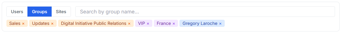
First step: choose who you want insights on. You can pick a specific user, but even better, select a group to get metrics for all its members in one go.
Way more convenient, and perfect for spotting trends across a team 😊
I query EntraID in real time with no local cache on the server, so it might be a bit laggy. Just relax, take your time, and wait for the response, no need to hammer the keyboard. 🙂
Nice, nice… but hey, what about SharePoint?!
Well, it's part of M365 too, right? So yep, you guessed it, I'm adding it to the search options!
Now you can pull insights not just for users or groups, but also for SharePoint sites.
Time to shine the spotlight on those sleepy document libraries!
As a result, you can build a custom list of items you want insights for, each one neatly color-coded by asset type.
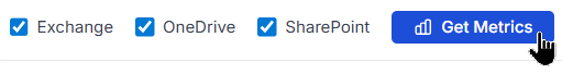
Now, hit “Get Metrics” and let the party begin!
Sit back as the tool fetches live data, crunches the numbers, and lights up your dashboard with real insights from your M365 tenant.
Because data is cool… but live data? That’s a whole vibe.
As a result, you’ll get a sweet bar chart showing the top 100 biggest accounts at a glance. And just below, two detailed tables packed with insights, neatly split into Users and SharePoint sites.
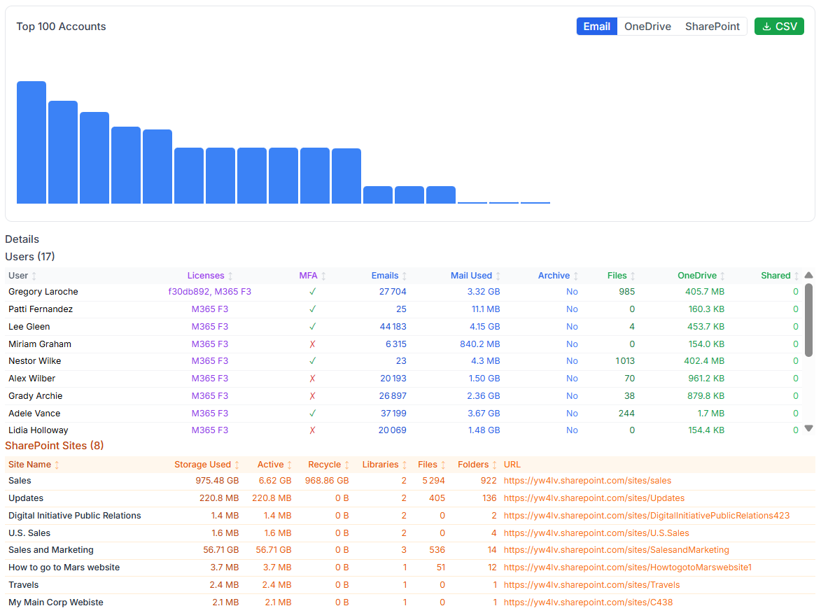
And yes, because I love you, my dear techies, there’s a CSV export button waiting just for you! 😘
Grab all those juicy metrics and use them on your own workloads, reports, or spreadsheets.
My dear techie friend, try dropping a wildcard "*" in the SharePoint selection field, let’s see what happens! 😉
12/09 Bonus Update: Relationship map !
Sometimes, it gets tricky to untangle the web of who has access to what, which user can reach which site? Does this group have access to that SharePoint?
Let’s cut through the confusion with a Relationship Map.
One visual, dynamic view that lays it all out in front of you, just as it is.
Clear, connected, and easy to grasp!
Take a peek at the top right corner of the “Get Metrics” view, you’ll spot a shiny "🔗Map" button.
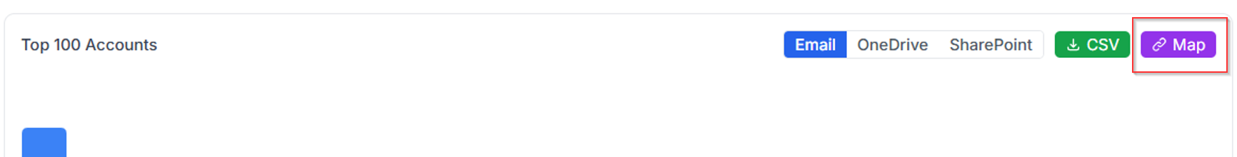
Click on it, and the Relationship Map will spring to life.
You'll see all the connections: users, groups, SharePoint sites, mapped out in a clean, interactive view.
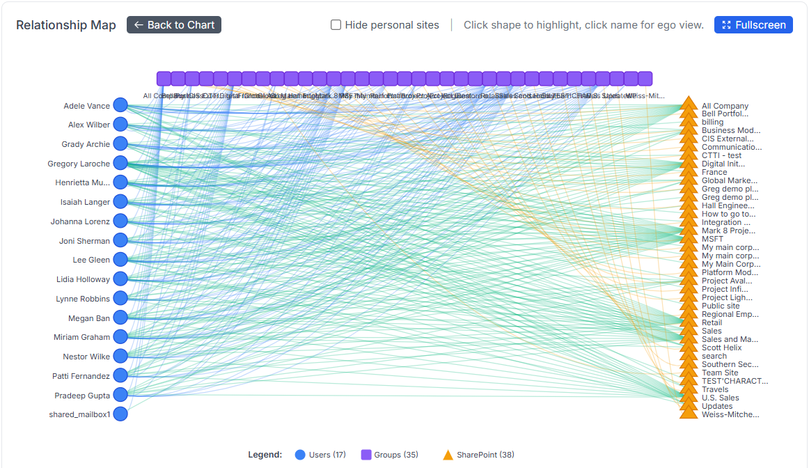
This map can get pretty dense with all that glorious info—so if things start feeling a bit cramped, just hit the “Fullscreen” button.
It’ll expand the view, giving you all the space you need to explore relationships in comfort.

Don’t want to clutter the map with all those personal sites? Easy peasy, my friend, just click the “Hide personal sites” toggle at the top, and they’re gone.

Now, if you click on one of the objects (yes, the objects, not the names!… not yet! 😉), the map will instantly highlight all its relationships.
Let’s take Henrietta as an example:

…which reveals Henrietta’s relationship map:
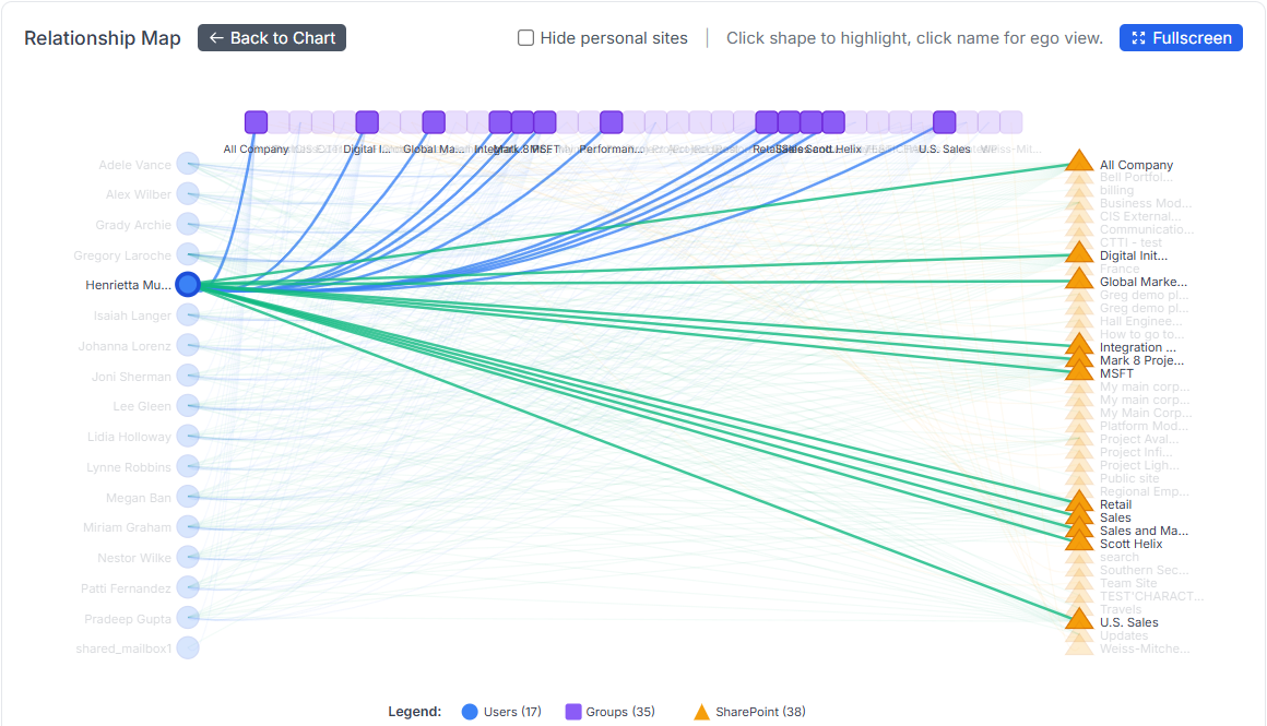
A clear, visual web of her group memberships, SharePoint access, and all linked assets.
No digging, no spreadsheets, just instant insight into her digital footprint across your tenant.
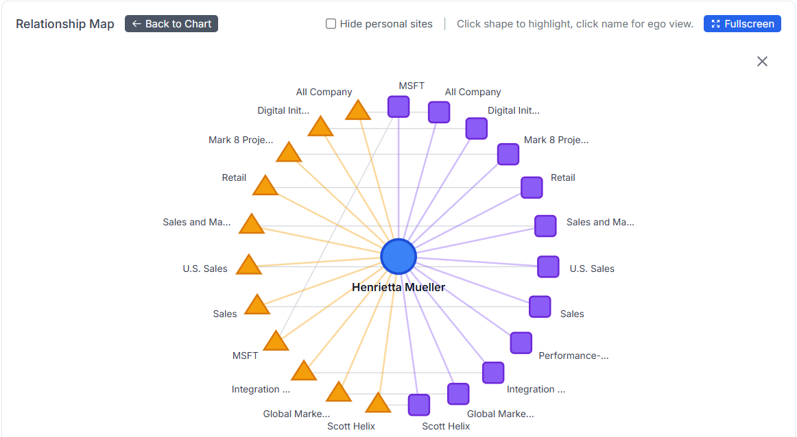
Now, let’s click on Henrietta’s name (not the object this time !) and you’ll unlock the Ego View.
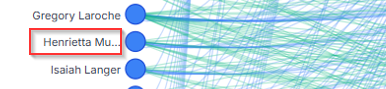
This zoomed-in spotlight shows only Henrietta and everything orbiting around her: groups, sites, mailboxes, connections.
It’s her M365 universe, and she’s the star. 😎
And just like that, you can click on any object to instantly reveal its relationships with others, users, groups, sites, you name it.
Easy, clear, and straight to the point.
No mystery left on the map!
12/29 Bonus Update: Scheduling jobs and randomization factor !
Alright, now we’ve got automation jobs running to create specific asset models, great start!
But let’s be honest: in real life, a mailbox doesn’t get blasted with a thousand emails and then go dark. Same for OneDrive or SharePoint, they don’t just receive a massive drop of files and sit idle for weeks.
More realistically, new data flows in day by day, a few emails, some files, a new page or two. That steady, incremental activity is what makes a tenant feel alive and gets you closer to a true-to-life scenario.
So let’s take it to the next level: just schedule your asset creation using the shiny new Schedule feature!
Set it once, choose the timing, and let the tool handle the rest. Whether it’s a daily trickle of emails, OneDrive uploads, or SharePoint updates, your tenant will grow over time, just like a real one.
You’ll now find a new option in the “Run” card that lets you set a schedule for your job:
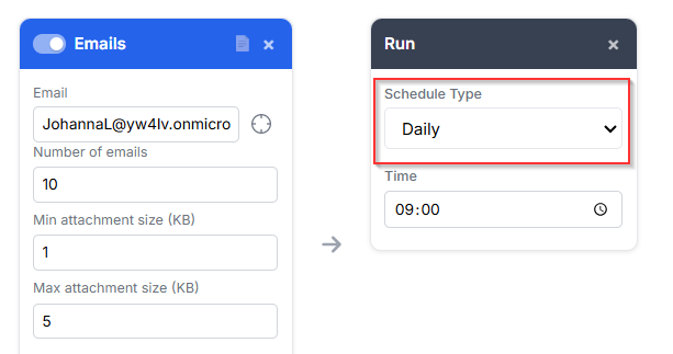
Choose your flavor: One-time, Daily, Weekly, or Monthly, whatever fits your flow.
Then just hit the “Run on Schedule” button, et voilà, your job is officially on autopilot.
Wanna check all your scheduled jobs? Just click the “View Scheduled Jobs” icon in the top right corner.
There, you’ll see the full list of everything you’ve got queued up: what runs, when, and how often.
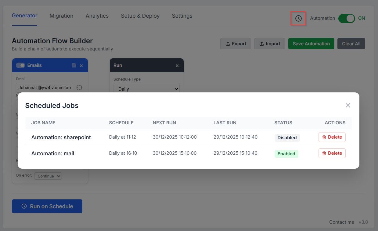
You can also take full control by disabling, deleting, or even rescheduling any job right from the list.
Need a break? Disable it.
No longer needed? Trash it.
Want it to run at a different time? Reschedule it.
That’s cool, Greg, but hey, it cranks out the same number of items every day! Real life isn’t that predictable, some days your inbox explodes, other days it’s a ghost town.
You’re absolutely right my friend, and that’s exactly where the new “Randomization Factor” steps in!
Let’s add a little chaos to keep things realistic!
At the bottom of the Emails, SharePoint, OneDrive, and Teams cards, you’ll find a new Randomization Factor field. It adds a % of variability to the values above.
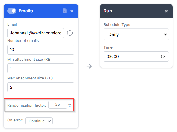
For example:
If you create an Email card with 10 emails and attachment sizes between 1KB and 5KB, then set a 25% randomization, each time the job runs (manually or scheduled), the values will shift within that range.
So instead of a fixed 10 emails, you might get anywhere from 7 to 13 emails per run, with the same variability applied to attachment sizes too, making everything feel way more real and dynamic!
01/19 Bonus Update: The deletion card !
New year, new update! 🎉
As we're now filling up our tenants at full speed, it's only fair to bring some automated cleanup into the game, because let’s be honest, manual deletion is nobody’s idea of fun.
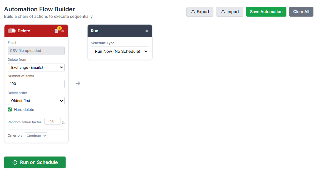
So here it is: I’ve added a brand-new “Deletion” card to the automation flow!
You can now schedule deletions automatically, choose how many items to remove, whether to start with the oldest or the newest, and pick between a soft delete (safer) or a hard delete (for the brave).
Keeping your tenant clean just got a whole lot easier, and way less boring.
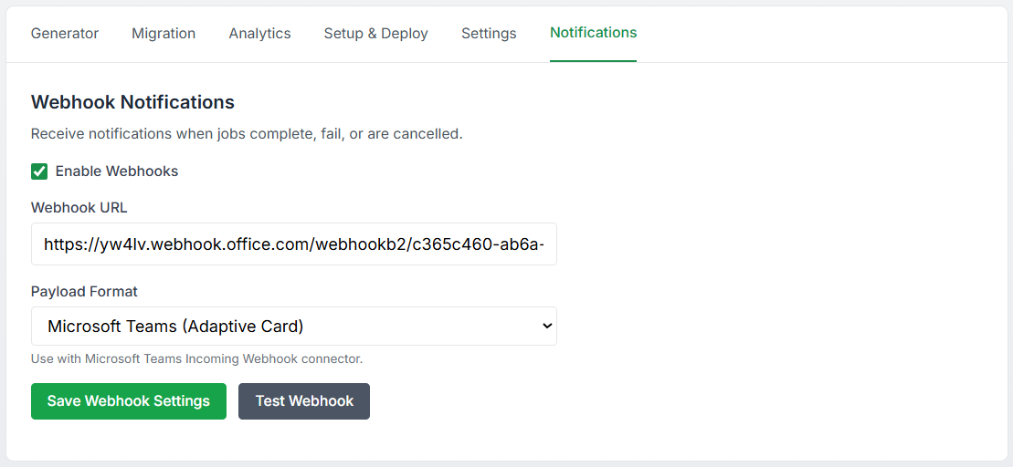
01/19 Bonus Update: Notifications !
Now that scheduled automation is live and running like clockwork, it’s only fair to keep you in the loop when a job finishes, whether it succeeds or fails.
So here comes a new addition: a Notifications tab!
You can now configure webhook-based alerts to get notified instantly. It supports multiple formats, so whether you're using n8n, Microsoft Teams, Slack, or even your own internal tool, it’ll work out of the box.
Flexible, simple, and ready to plug into your workflow.
01/19 Bonus Update: Dark mode !

Yes, for those of us who enjoy living in a cave, rocking a glorious beard, and only stepping out under the moonlight, I've got you covered: welcome to the Dark Mode zone! 😄
I’m taking care of you, my dear fellow techies!
You’ll find the Dark Mode toggle right here:
Enjoy the comfort of low light and high focus! 😀
01/27 Bonus Update: MCP server !
Yes, it’s time to put your Claude LLM to work and give that nervous clicking a break! 😄
Just chat with Claude, ask for actions on the M365 Generator, and it’ll handle them, smartly and in style.
Want the full story? Check out my dedicated article here for more details.
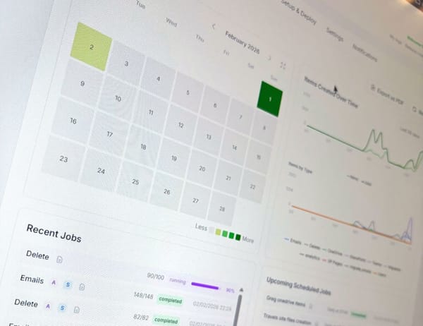
02/04 Update: V4.0 is out and bring a full interactive Dashboard !
Now that we can schedule complex workflows, it quickly becomes tricky to keep track of everything, what runs when, and which scheduled plan does what.
It’s time to bring some clarity to the chaos.
Ladies and Gentlemen, allow me to introduce our brand new Dashboard!
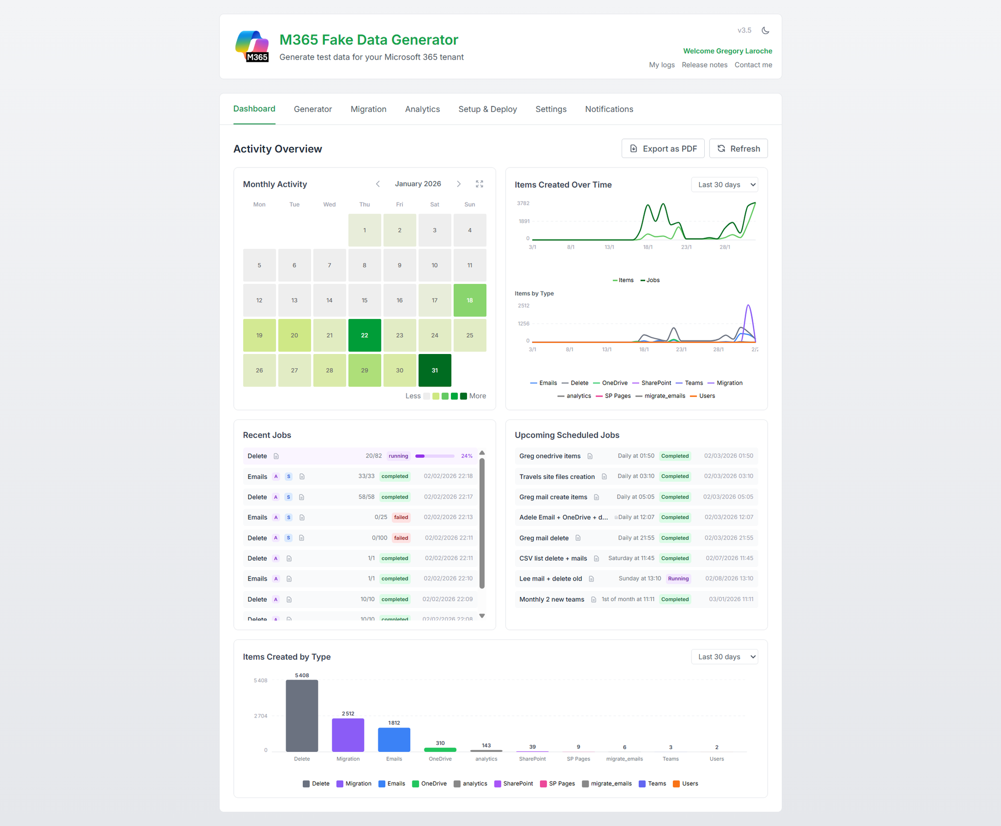
Your command center for all things automation, track scheduled plans, monitor execution, and finally get a clear view of what’s happening, when, and why. 🔎
How does it works?
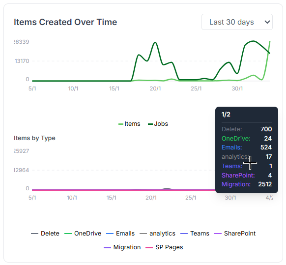
The Dashboard comes packed with 5 widgets to keep you fully in control:
- A monthly heatmap showing data volume, broken down by type, emails, files, pages, and more.
- A trend graph tracking how job executions and item creations evolve over time.
- A list of recent job executions, complete with status to see what ran and how it went.
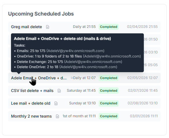
- A list of upcoming scheduled jobs, so you know exactly what’s on deck.
- A data type breakdown view showing the proportion of each item type created.
But all theses widgets are interactive ! Let’s take a closer look at what each widget can do.
The Monthly Activity heatmap calendar widget
The heatmap is color-coded by activity. You can instantly spot low-activity days and high-traffic spikes. Just hover your mouse over a day to see a tooltip with detailed stats: number of items, job count, and a breakdown by item type.
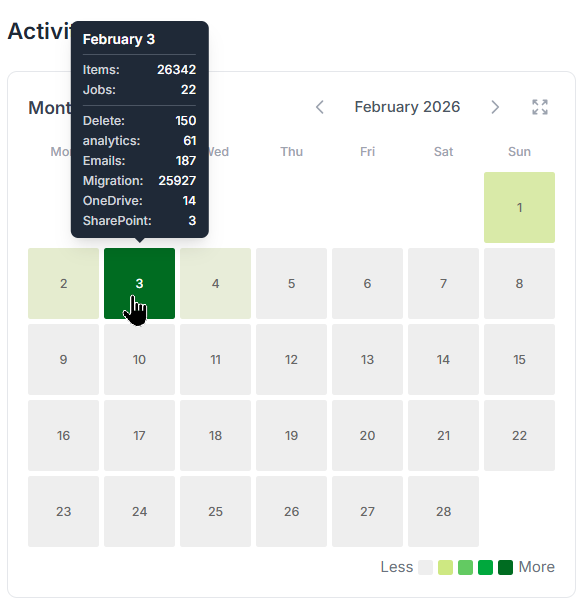
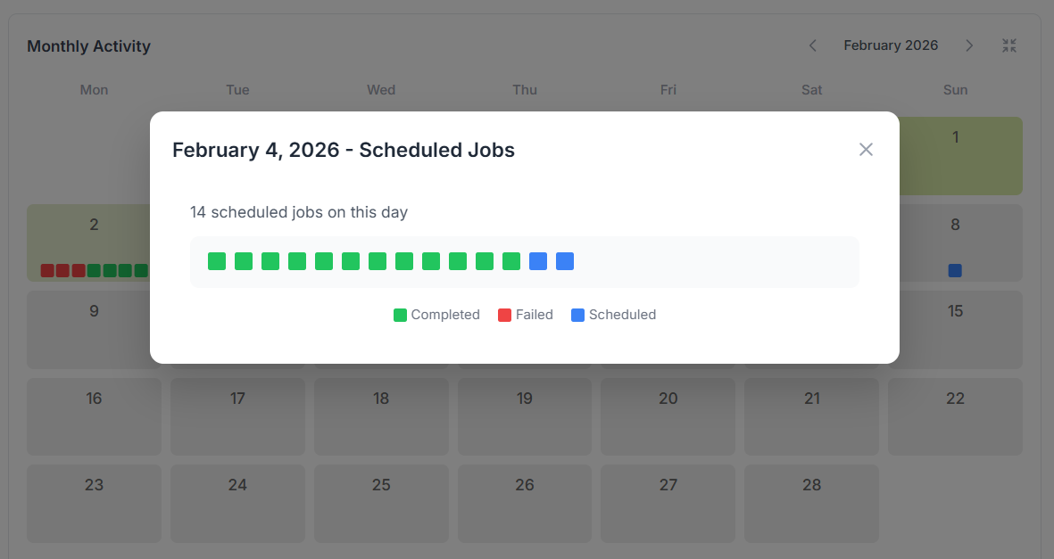
Want more details? Just click on the day to open the detailed view.
You’ll see a deeper layer with all scheduled jobs, what ran, what’s coming, all based on their plan.
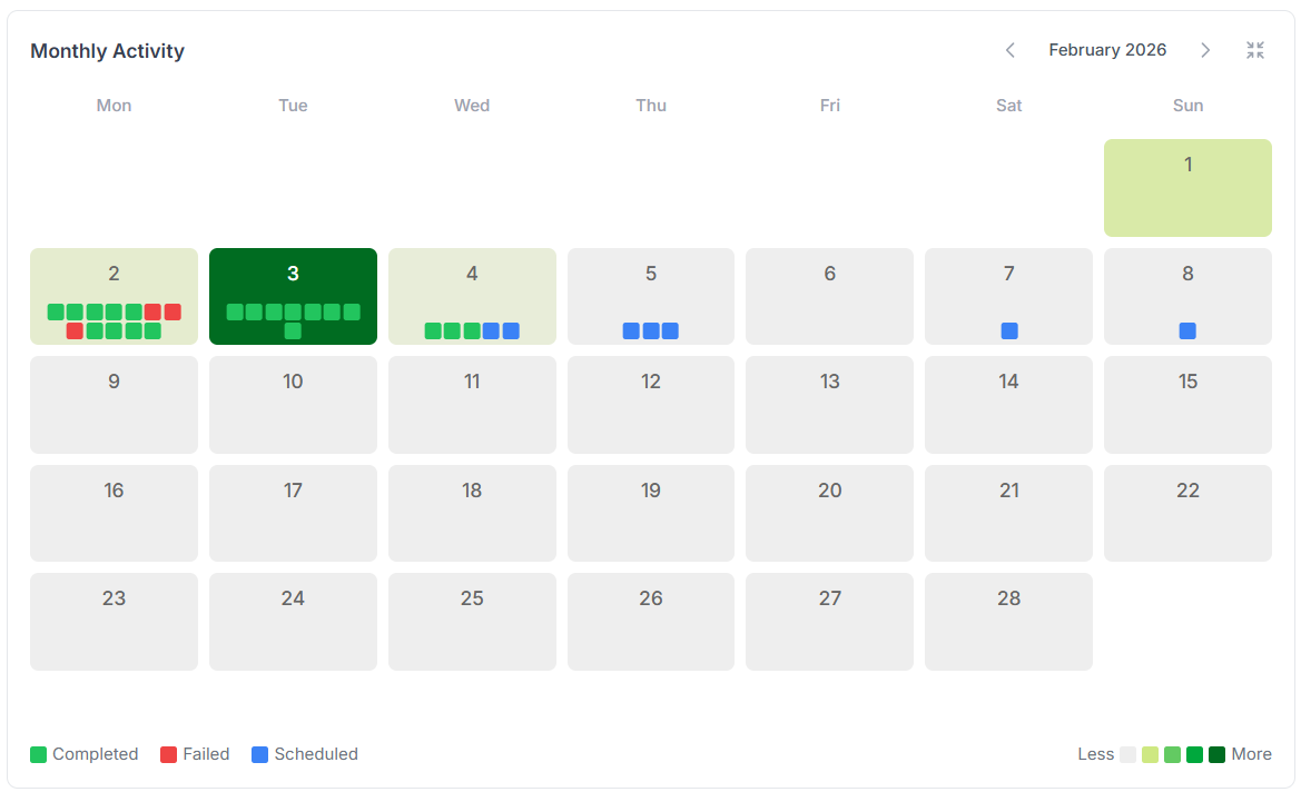
Each dot represents a scheduled job, green for successful runs, red for failures, and blue for upcoming ones.
Hover over a dot to see a quick summary of that job’s execution.
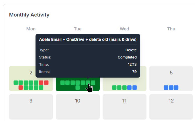
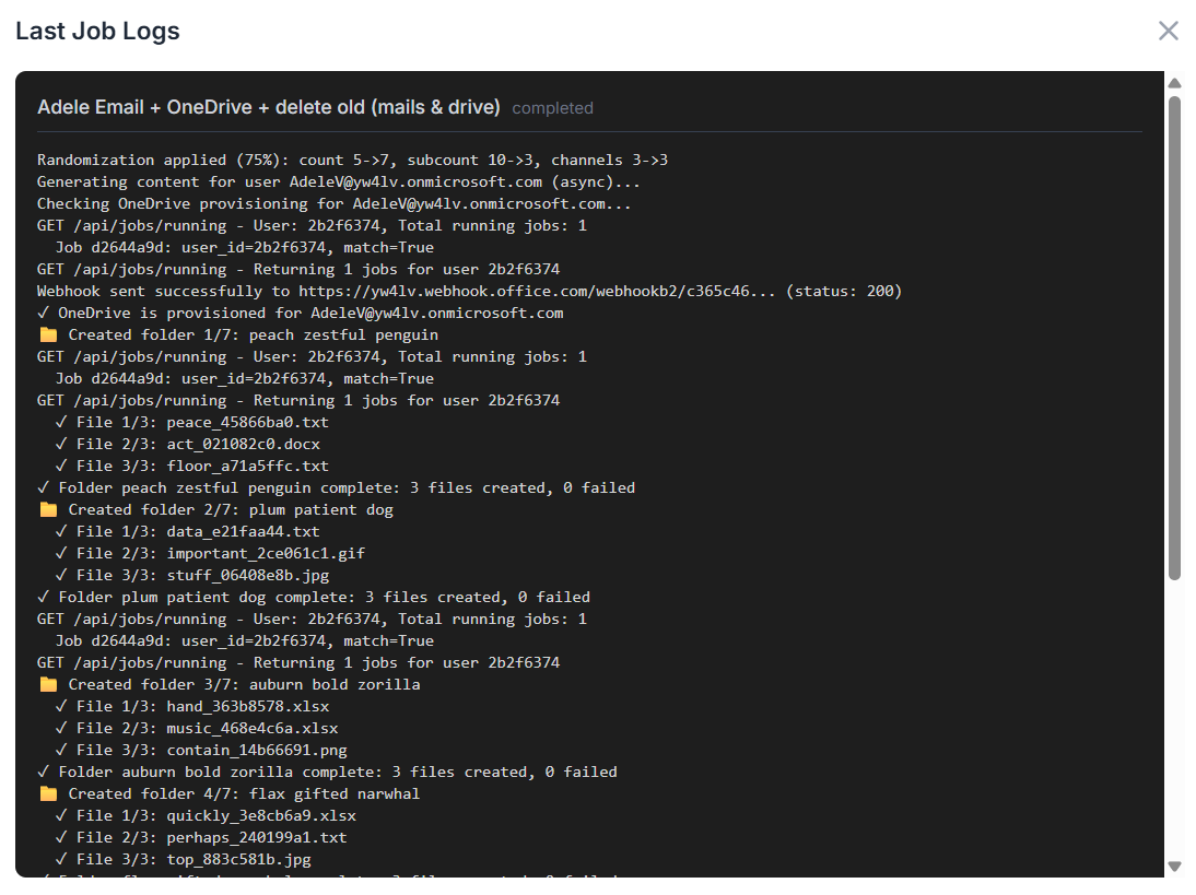
Want even more details? Go ahead, click on a dot and unleash the full logs. Every step of the job is there, crystal clear and ready for inspection!
Oh boy, I’ve got so many scheduled jobs running each day that the dots barely fit in those tiny squares! 😅
No worries, mate, just click on the "+" icon that shows up after the last dot, and unleash the full daily view for the complete picture!
The trend graph activities widget
These two line graphs show how created items, running jobs, and item types change over time.
Same deal, hover your mouse to see detailed tooltips pop up with all the juicy info.
The upcoming scheduled jobs widget
All scheduled jobs are listed here in one clean view. You can easily track when each job last ran, whether it succeeded or failed, and when it’s scheduled to run next.
And of course, if you're after more details, just hover your mouse and the extra info appears.
Now that we’ve got scheduled jobs running, let’s not forget, each one is actually a full automation flow on a timer. That means it can run through a whole series of tasks in one go... and yes, we need to track that too. This is where comes ...
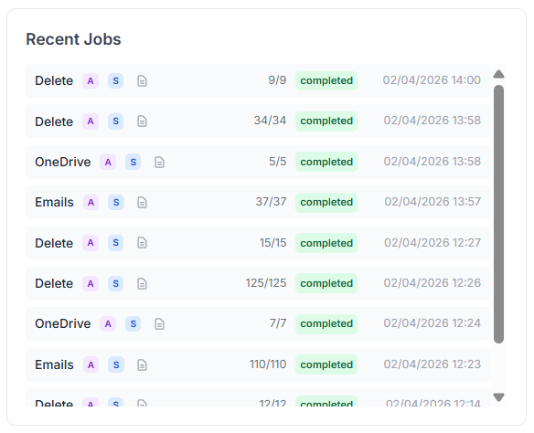
The recent job executions widget
Here, every executed job is listed, whether it came from a manual run, a one-off task, or a full automation flow, scheduled or not.
Everything’s tracked, all in one place, every job, every time. ✅
And finally, our last widget:
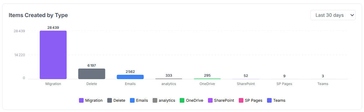
The data type breakdown widget
Curious how many emails were created? Wondering if OneDrive files spiked this month or if SharePoint took the lead?
Get a full breakdown of item creation, by month, week, or even day.
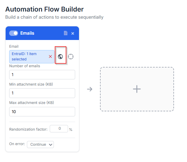
02/04 Update V4.0: connect to EntraID for selection
In the automation flow, you can stack multiple cards to streamline your process. Each card needs an input, for example, an Email card requires a target user account to create the emails.
If you’ve got a long list of users, you can use a CSV file. Not bad… but hey, we’ve got Entra ID, right? And Entra ID has groups, right?
You see where this is going? 😄
Yes! You can now directly use Entra ID users or groups as inputs for your cards. The data will be created for those users or for every member of the selected group, easy, and no more spreadsheets!
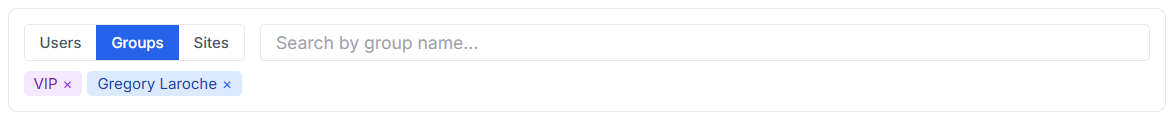
To query your Entra ID for users, groups, or even SharePoint sites, just click the little 🌍 icon next to the field. It opens the directory search.
then a selector will appear to let you chose all the users or groups you want to select:
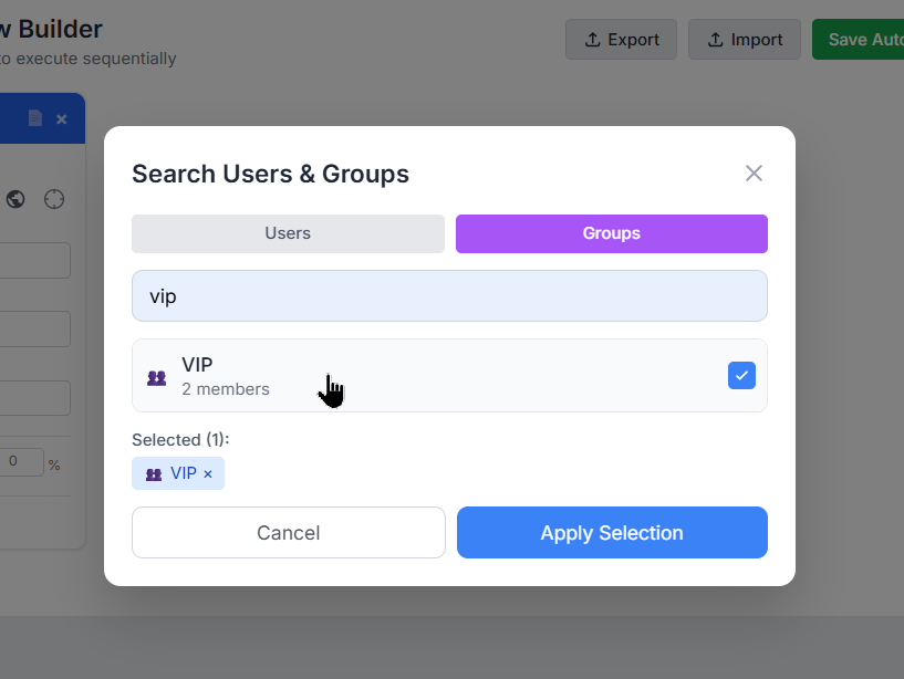
It works like a charm on these cards: Email, OneDrive, SharePoint File, SharePoint Page, Migration, and Delete. Pick your targets, and let the automation do the rest!
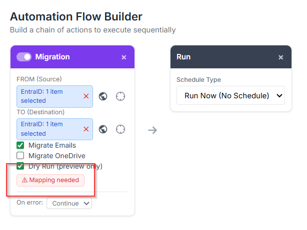
02/04 Update V4.0: multiple-to-multiple user migration
Now that we can add groups to cards, yeah, that’s cool, but wait... does that mean in a Migration card I can migrate from one group’s members to another group’s members?
Absolutely YES!
In the Migration card, you can pick anything for the FROM field: users, groups, or even a mix of both. Same goes for the TO field.
Fun, right?! 😄
But wait, Greg, hold on! Who’s migrating to who?! That sounds like total chaos!
You’re absolutely right, my friend, that’s exactly where our shiny new helper steps in: the Mapping Modal!
Just select at least one group in both the FROM and TO fields, and boom, a new option appears right inside the card.
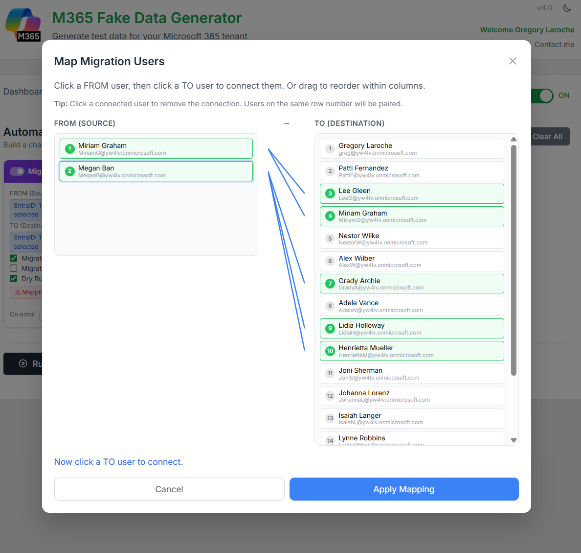
Click it to open the modal and define exactly who migrates to who:
Now just draw the lines, literally!
Connect who’s migrating from and who’s landing to.
It’s drag, drop, done. Simple, visual:
That’s it, my techie friends, your tenant’s alive, buzzing, and growing like it’s on caffeine.