M365 Generator v4.0 is out!
V4.0 introduces a powerful interactive Dashboard for M365 Generator. Track scheduled workflows, understand what runs when, and gain full visibility into your automations. More data, more control, and clearer insights to manage complex Microsoft 365 operations efficiently.

V4.0 is out and bring a full interactive Dashboard !
Let’s keep the adventure rolling with the M365 Generator, more data, more automation, and way more fun ahead!
I just realize that as now we can schedule complex workflows, it quickly becomes tricky to keep track of everything, what runs when, and which scheduled plan does what.
It’s time to bring some clarity to the chaos.
Ladies and Gentlemen, allow me to introduce our brand new Dashboard!
Your command center for all things automation, track scheduled plans, monitor execution, and finally get a clear view of what’s happening, when, and why. 🔎
How does it works?
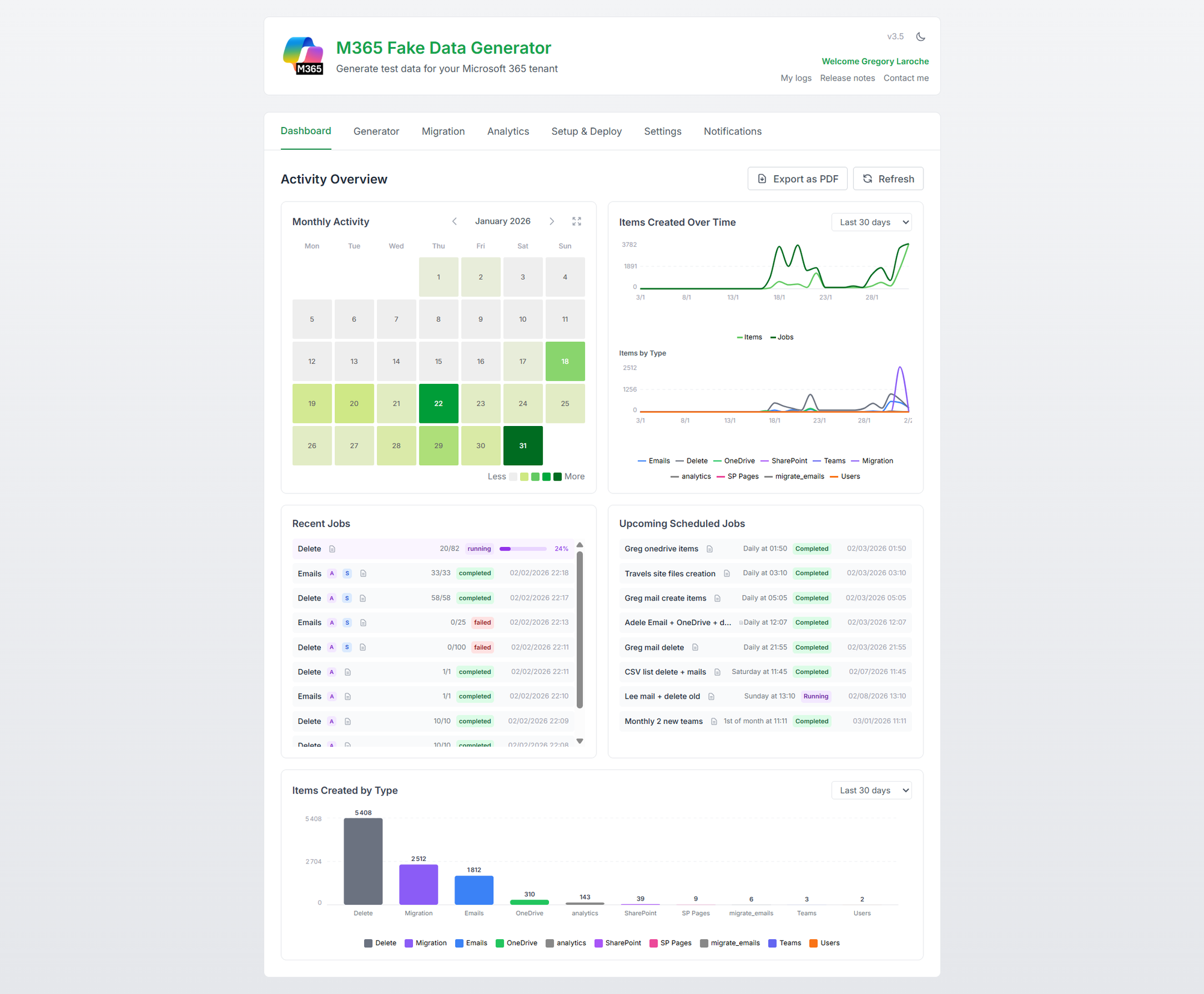
The Dashboard comes packed with 5 widgets to keep you fully in control:
- A monthly heatmap showing data volume, broken down by type, emails, files, pages, and more.
- A trend graph tracking how job executions and item creations evolve over time.
- A list of recent job executions, complete with status to see what ran and how it went.
- A list of upcoming scheduled jobs, so you know exactly what’s on deck.
- A data type breakdown view showing the proportion of each item type created.
But all theses widgets are interactive ! Let’s take a closer look at what each widget can do.
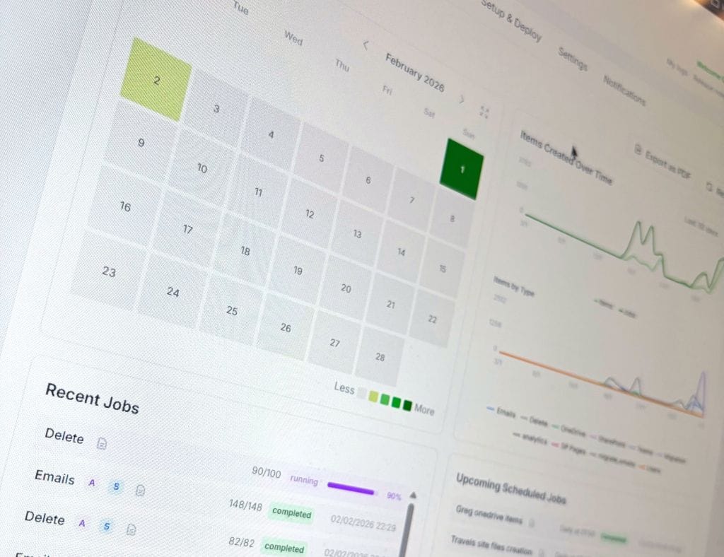
The Monthly Activity heatmap calendar widget
The heatmap is color-coded by activity. You can instantly spot low-activity days and high-traffic spikes. Just hover your mouse over a day to see a tooltip with detailed stats: number of items, job count, and a breakdown by item type.
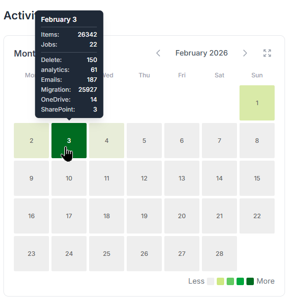
Want more details? Just click on the day to open the detailed view.
You’ll see a deeper layer with all scheduled jobs, what ran, what’s coming, all based on their plan.
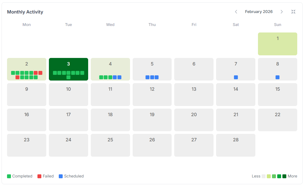
Each dot represents a scheduled job, green for successful runs, red for failures, and blue for upcoming ones.
Hover over a dot to see a quick summary of that job’s execution.
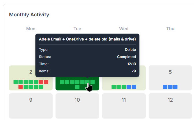
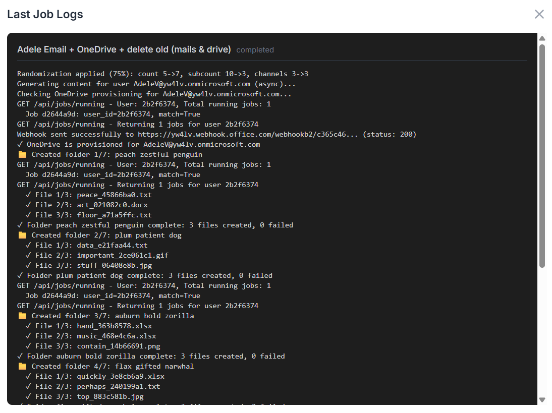
Want even more details? Go ahead, click on a dot and unleash the full logs. Every step of the job is there, crystal clear and ready for inspection!
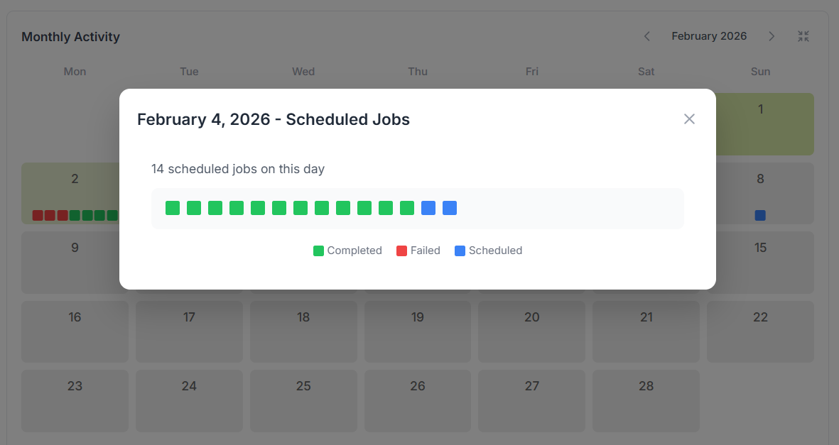
Oh boy, I’ve got so many scheduled jobs running each day that the dots barely fit in those tiny squares! 😅
No worries, mate, just click on the "+" icon that shows up after the last dot, and unleash the full daily view for the complete picture!
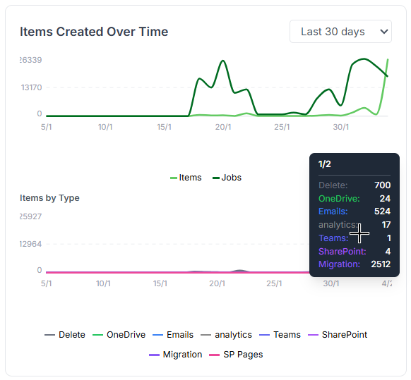
The trend graph activities widget
These two line graphs show how created items, running jobs, and item types change over time.
Same deal, hover your mouse to see detailed tooltips pop up with all the juicy info.
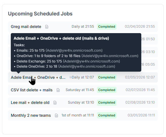
The upcoming scheduled jobs widget
All scheduled jobs are listed here in one clean view. You can easily track when each job last ran, whether it succeeded or failed, and when it’s scheduled to run next.
And of course, if you're after more details, just hover your mouse and the extra info appears.
Now that we’ve got scheduled jobs running, let’s not forget, each one is actually a full automation flow on a timer. That means it can run through a whole series of tasks in one go... and yes, we need to track that too. This is where comes ...
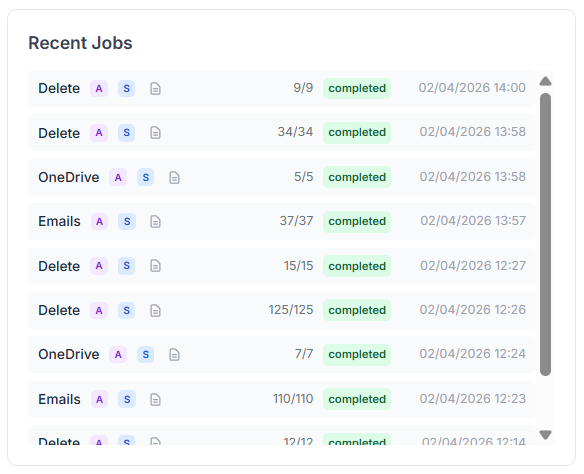
The recent job executions widget
Here, every executed job is listed, whether it came from a manual run, a one-off task, or a full automation flow, scheduled or not.
Everything’s tracked, all in one place, every job, every time. ✅
And finally, our last widget:
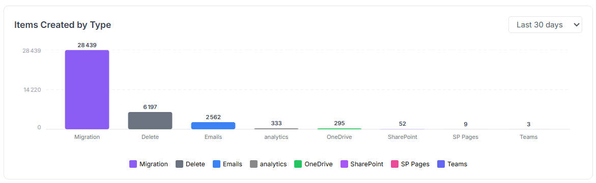
The data type breakdown widget
Curious how many emails were created? Wondering if OneDrive files spiked this month or if SharePoint took the lead?
Get a full breakdown of item creation, by month, week, or even day.
V4.0: Connect to EntraID for selection
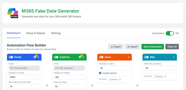
In the automation flow, you can stack multiple cards to streamline your process. Each card needs an input, for example, an Email card requires a target user account to create the emails.
If you’ve got a long list of users, you can use a CSV file. Not bad… but hey, we’ve got Entra ID, right? And Entra ID has groups, right?
You see where this is going? 😄
Yes! You can now directly use Entra ID users or groups as inputs for your cards. The data will be created for those users or for every member of the selected group, easy, and no more spreadsheets!
To query your Entra ID for users, groups, or even SharePoint sites, just click the little 🌍 icon next to the field. It opens the directory search.
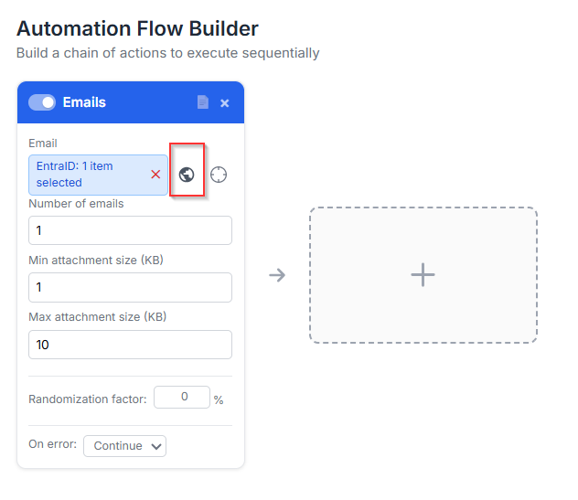
then a selector will appear to let you chose all the users or groups you want to select:
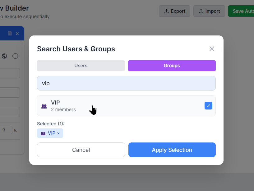
It works like a charm on these cards: Email, OneDrive, SharePoint File, SharePoint Page, Migration, and Delete. Pick your targets, and let the automation do the rest!
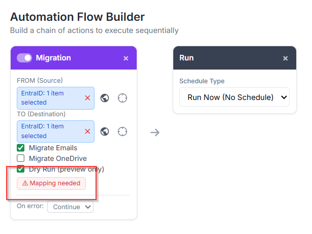
V4.0: multiple-to-multiple user migration
Now that we can add groups to cards, yeah, that’s cool, but wait... does that mean in a Migration card I can migrate from one group’s members to another group’s members?
Absolutely YES!
In the Migration card, you can pick anything for the FROM field: users, groups, or even a mix of both. Same goes for the TO field.
Fun, right?! 😄
But wait, Greg, hold on! Who’s migrating to who?! That sounds like total chaos!
You’re absolutely right, my friend, that’s exactly where our shiny new helper steps in: the Mapping Modal!
Just select at least one group in both the FROM and TO fields, and boom, a new option appears right inside the card.
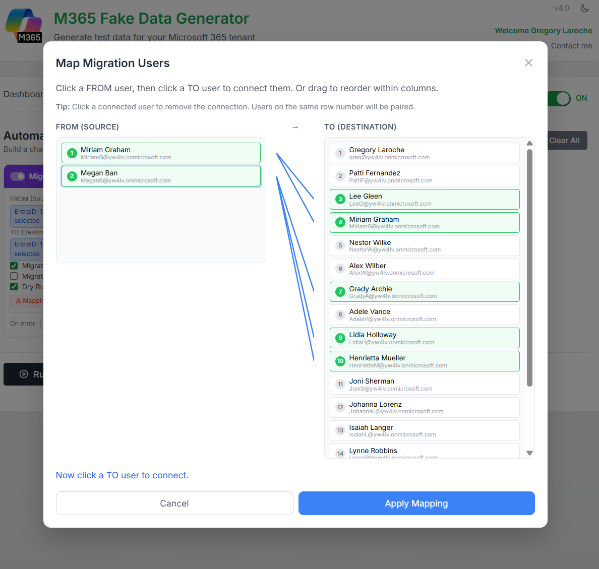
Click it to open the modal and define exactly who migrates to who:
Now just draw the lines, literally!
Connect who’s migrating from and who’s landing to.
It’s drag, drop, done. Simple, visual:
Previously, accessing the M365 Generator tool required a login and password.
Since then, the beta phase has ended and the tool is now public.
There is now a single, simple address: https://www.m365simulator.com

And there you have it, my techie friends, your tenant’s now running full throttle, humming with activity like a data center on overdrive. ⚡