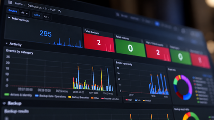


VDC, aka Veeam Data Cloud, already comes with built-in reports, and they do exactly what they are supposed to do. But hey, they are designed to work for as many customers as possible, and I wanted something a little more... me. 😉😁
I wanted reports built specifically around my needs, with the metrics I care about, the views I like, the little details I always want to see, and trust me, there are quite a few of them!
So, quick question: Can I build my own?
- Answer is: For sure my friend! 👀✨
And a huge thanks goes to the new MCP server available directly from the VDC platform, which opens the door to something much more interesting.
Let’s see how to build a fully tailored, automated, interactive, and actually useful reporting experience. Not just another report, but a proper control dashboard for my VDC organization.
Summary
- Connection to VDC MCP server
- The 3 steps using Claude cowork
- the inital build
- Automatic daily refresh using scheduled task
- The on demand live refresh button
- The big picture
- What is the result?
- Fast track!
- So, what do this mean?
We’ll use Claude Cowork to build the dashboard and keep it updated with live VDC metrics through the MCP connector.
So, first things first: let’s connect Claude Desktop to the Veeam MCP server and make sure our little dashboard can actually talk to VDC.
1/ Connection to VDC MCP server
That’s a pretty easy-peasy process, but there are actually two ways to do it:
- The clean and supported way, using your VDC organization credentials.
- The slightly Claude desktop off-track workaround but definitely more fun way, using the under-development service account approach. 🤘😎
👉 1-Using your VDC organization credentials
First, open Claude in your browser, head to Settings, then open “Connectors” and click “Add a custom connector”.
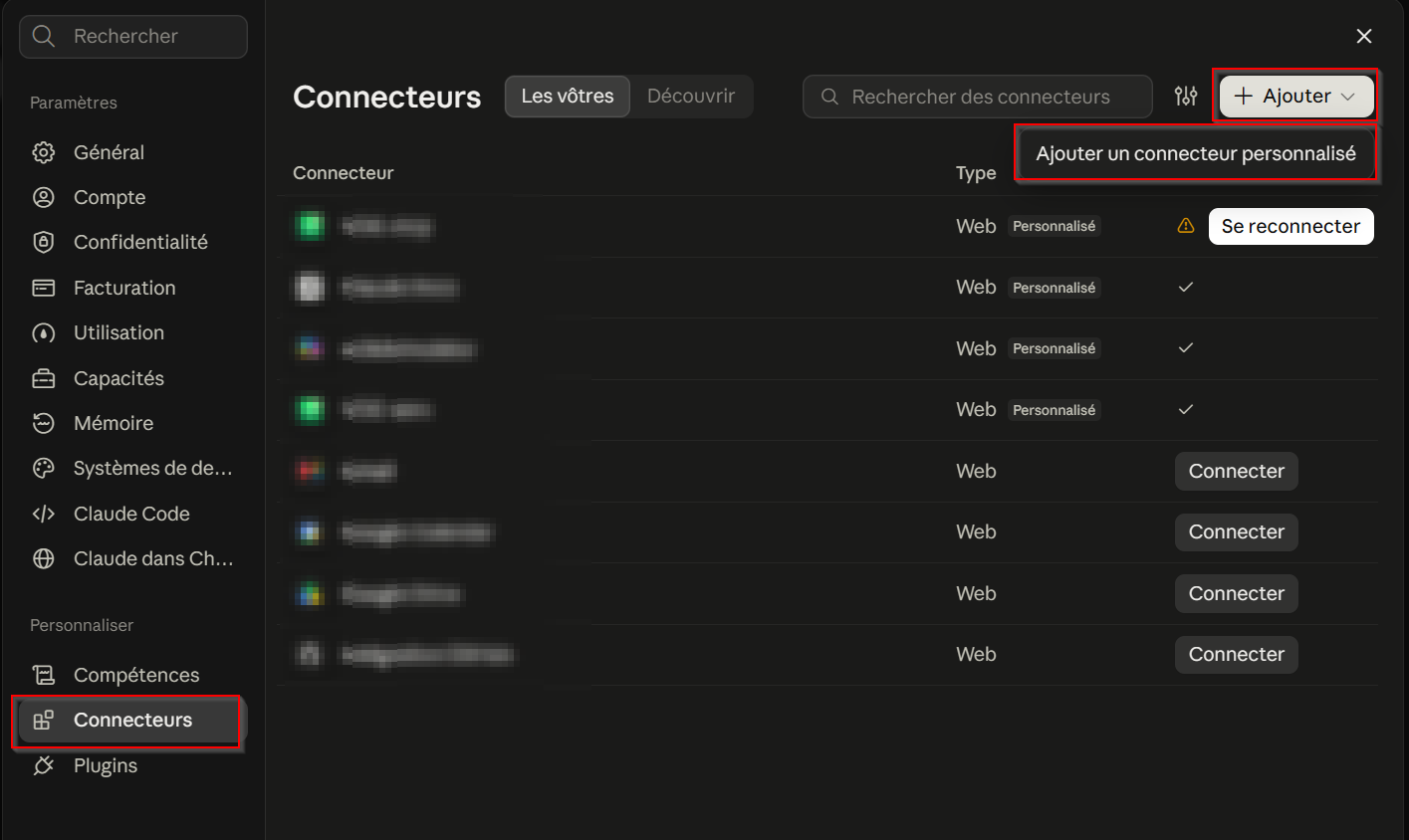
Then fill in the required information:
- Connector name: whatever you want to call it.
- Veeam MCP server endpoint: https://mcp.cloud.veeam.com/mcp
Once that’s done, move to the next screen and select the following options:
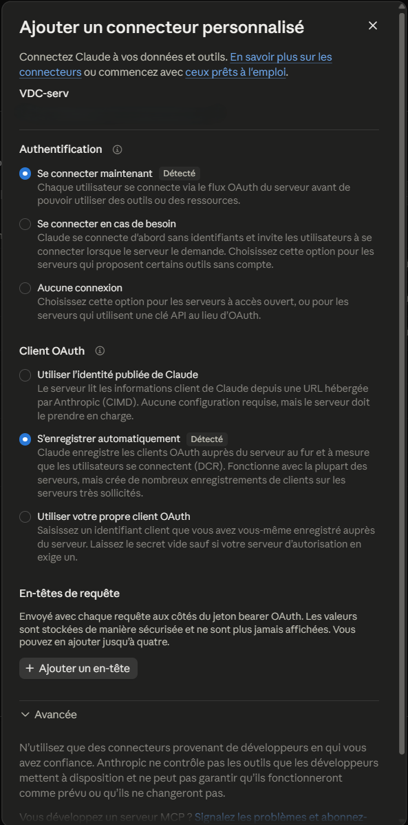
And finally, hit “Connect”, sign in with your VDC organization credentials, and voilà, your Veeam MCP connector should be up and running in just a few clicks.
👉 2-Using the under development service account
Since MCP service accounts are not publicly available yet, you currently need to be part of the Veeam Private Preview program to use this approach.
For this connection, we’ll take the local route and use an NPM package called mcp-remote, together with a small bridge file that does the plumbing between stdio and HTTP.
To install this package, please have a look to mu latest article where I discribed how to add mcp-remote to your Windows.
👉 How I optimize my work with the 2nd brain concept
Ok now, first, create a service account in your VDC M365 settings. Once created, you should get two important pieces of information:
- Client ID
- Client Secret
- VDC org ID
Keep them safe, we’ll need them in a minute.
Next, copy the bridge file to a well-known location on your machine, somewhere clean and permanent where Claude Desktop can always find it.
Why we use a small bridge for the Veeam MCP service account?
VDC MCP server now supports service accounts: a dedicated identity with its own permissions and audit trail, and no hourly sign-in.
For security, Veeam issues each access token for one destination only, the VDC MCP server, and makes it expire quickly.
To get that token, the connection has to state its destination but Claude Desktop's standard connector doesn't pass that detail yet.
The bridge is a small script that runs next to Claude Desktop. It requests the token the way Veeam expects, renews it automatically in the background, and relays Claude's requests.
Everything else, including identity checks, permissions and auditing, stays with Veeam's MCP server.
Once Claude Desktop supports this natively, the bridge can simply be removed.
Ok now next step, let's edit your "%APPDATA%\Claude\claude_desktop_config.json" and add the bloc for the MCP connection as below:
{
  "mcpServers": {
    "vdc-stage": {
      "command": "node",
      "args": ["C:\\Users\\greg\\.mcp\\vdc-mcp-bridge.mjs"],
      "env": {
        "VDC_MCP_URL": "https://mcp.cloud.veeam.com/mcp",
        "VDC_CLIENT_ID": "<yourID>",
        "VDC_CLIENT_SECRET": "<your_secret>",
        "VDC_ORGANIZATION_ID": "your_org_ID"
      }
    }
},Optionally, you can first test that the bridge is behaving properly with PowerShell and your connection details by running:
$env:VDC_MCP_URL="https://mcp.cloud.veeam.com/mcp"; $env:VDC_CLIENT_ID="<yourID>"; $env:VDC_CLIENT_SECRET="<secret>"; '{"jsonrpc":"2.0","id":1,"method":"initialize","params":{"protocolVersion":"2025-06-18","capabilities":{},"clientInfo":{"name":"t","version":"1"}}}' | node "$env:USERPROFILE\.mcp\vdc-mcp-bridge.mjs"Finally, one last step: fully exit Claude Desktop, kill the process completely, then start it again.
Once Claude is back, go to "Settings" → "Developer".
If everything is wired correctly, you should see your local connector up and running, ready to do its little MCP bridge job.
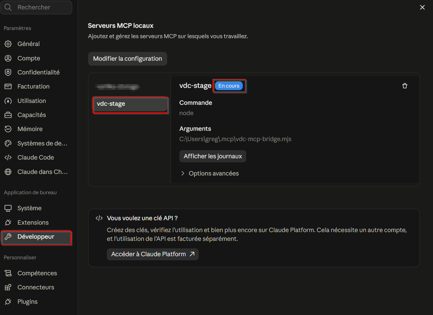
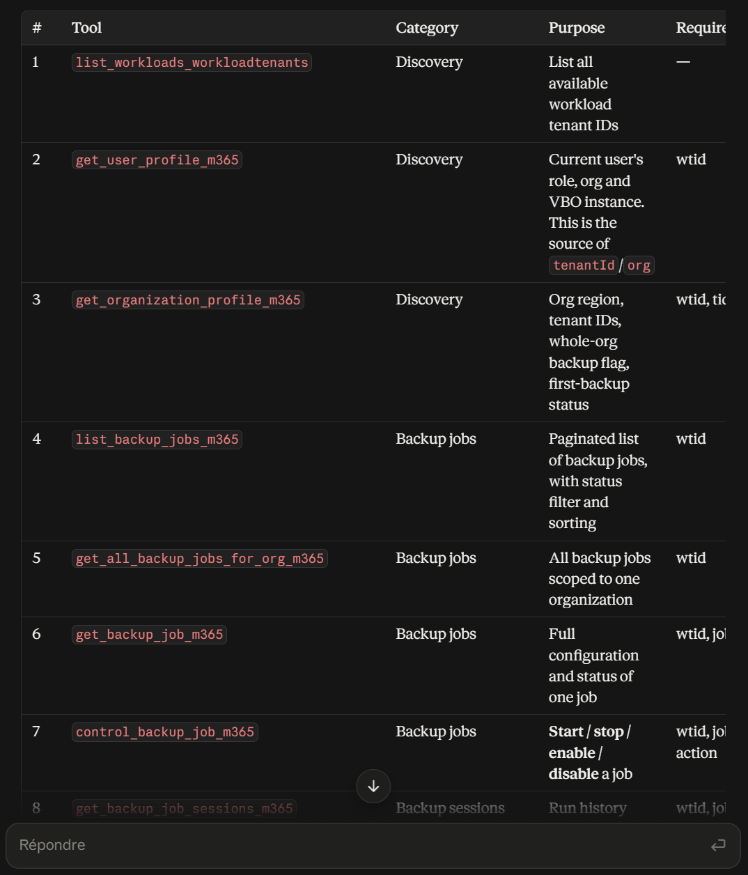
To double-check everything is working, simply ask Claude about the available Veeam MCP tools with a quick prompt like:
create a simple table that list all the tools available from VDC MCP serverIt should return a table like the following:
2/ The 3 steps using Claude Cowork/Desktop
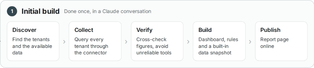
1-the initial build
Before anything can run on autopilot, we first need to build the machine once.
That initial build happens in a single conversation with Claude. It connects to Veeam Data Cloud, explores the available data, grabs the metrics we need, checks that everything makes sense, and starts shaping the dashboard around them.
Think of it as teaching Claude the playground before letting it run around on its own.
Step 1: Discovery phase
Claude does not start by building shiny charts straight away. First, it has a little look around, like opening every cupboard in a new kitchen before deciding what to cook.
Through the Veeam Data Cloud MCP connector, it starts with two simple questions: which tenants are available, and what data can I actually retrieve from them?
In my case, Claude discovered 14 tenants: 9 Microsoft 365, 3 Entra ID, and 2 Vault. It also mapped which MCP tools were available for each workload.
That detail matters. If the data is not available, the dashboard should not magically invent it. No fake numbers sneaking into my shiny report!
The logic is simple: understand the playground first, then build the dashboard around what is really there.
Connect to my Veeam Data Cloud environment using the VDC MCP connector.
Before building anything, look around:
- List all available MCP tools from the VDC MCP server and test them.
- List all my workload tenants and tell me which workloads they are
  (Microsoft 365, Entra ID, Vault).
- For each workload, tell me which tools are available and what
  kind of data they return (protection status, jobs, history, storage,
  threats…).
- Tell me clearly what is NOT available, so we don't show data we don't have.
Give me a short summary table. Don't build the report yet.
Step 2: Data Collector phase
Now that Claude knows where everything is hiding, it is time to go shopping for data.
It queries each tenant through the VDC MCP connector and collects the information needed for the dashboard, including:
- protected object counts,
- 90 days of backup history,
- every backup run from the last 7 days, with its status,
- restore activity,
- backup jobs, storage usage, and licensed users for each Microsoft 365 tenant,
- threat detection results.
In my case, this meant around 70 MCP calls. Quite a bit of chatting between Claude and VDC! 😄
But there is one golden rule: every number displayed in the final dashboard must come from one of those calls. Mandatory.
No guessing, no creative mathematics, no mysterious numbers appearing from nowhere.
If a metric is not available, the dashboard simply says so.
Better an honest "data unavailable" than a beautiful chart telling fairy tales.
Now collect the real data for every tenant. Use only the VDC MCP connector.
I want:
- protected and unprotected objects per tenant and object type
- the daily backup history for the last 90 days (success, warning, error)
- every backup run of the last 7 days with its status and duration
- restore activity
- for each Microsoft 365 tenant: backup jobs, storage per month,
  restore points and licensed users
- threat detection results for every tenant
Rule: every number must come from a tool response. If something fails
or isn't available, write it down. Never guess and never replace missing
data with zero.
Step 3: Verify
This is where Claude stops being just a data collector and starts behaving like a careful analyst.
Before anything reaches the dashboard, the collected data is cross-checked for consistency, accuracy, and reliability. Timestamps, units, tenant scope, duplicate values, mismatched results, and suspicious outputs all need to make sense before they are trusted.
The rule here is simple: if something looks wrong, Claude should question it, compare it with other available signals, and exclude it if it cannot be validated.
That verification step is critical. A dashboard can look beautiful, but if the numbers are wrong, it is worse than useless.
So before building charts and KPIs, make sure the data itself deserves to be there.
Before we build anything, double-check the data like a careful colleague.
- Compare the same information coming from different tools. Do the
  timestamps, counts and statuses match?
- Tell me the unit of every storage value. If it isn't written anywhere,
  say so, don't assume.
- If a tool returns data that looks wrong, flag it and don't use it.
List every issue you find, in plain words, with what you'll do about it.
Step 4: Build
Now comes the fun part: turning all that verified data into something I actually want to use.
Claude builds the report as an interactive web page, organized into clear sections such as the main dashboard, tenant views, workload-specific pages, alerts, and trends. let your imagination flow, and describe here any reports your want to see in this dashboard.
My choice was that the visual style follows the Veeam look and feel, so the result feels familiar instead of looking like a random side project. But it's up to you to choose the visual style you like the most.
I also defined simple and transparent status rules to highlight what needs attention with Critical, Warning, healthy and not monitored.
The important point is that those rules are visible in the report, so it's easy to understand why a tenant is marked Healthy, Warning, or Critical.
And there is one clever little safety net: I asked Claude embeds a snapshot of the collected data directly inside the report. So even if the VDC MCP live connection is not available later, the dashboard can still open and show the last known state.
Pretty dashboard, clear logic, and its own emergency food supply. Not bad. 😄
Now build an interactive report as a single web page, using only the
data you verified.
- 6 pages: Dashboard, Tenants, Microsoft 365, Entra ID, Alerts,
  Trends & activity.
- Make it look like the Veeam Data Cloud console: white background,
  Veeam green, clean cards, left sidebar, simple charts. see the screenshot above.
- Give every tenant a status with simple rules you show in the page:
  last backup failed → Critical, only warnings → Warning,
  all good → Healthy, no data → Not monitored.
- Add filters by workload, tenant and period (default view is last 30 days).
- Keep a copy of the data inside the page, so it still opens even
  when nothing else is available.
Keep the text short. It's a dashboard, not a document.
Step 5: Publish
Last step: Claude publishes the report as a Claude Artifact, basically a private interactive web page hosted on claude.ai.
At this point, I can open it, click around, filter by tenant or workload, explore the details, and drill into failed jobs without digging through raw data or jumping between multiple screens.
And that is the initial build done.
At this point, you can iterate with Claude and fine-tune the dashboard until it really feels like yours. Adjust the layout, tweak the visuals, move things around, rename sections, or polish the little details until everything looks exactly the way you want.
Publish the report as a Claude artifact, private for now.
- Add a Refresh button that fetches live data from VDC through my
  connector, with a clear loading state.
- Show when the data was last retrieved, so no one thinks old
  data is live.
- Give me the link and a 3-line summary: how many tenants,
  which ones need attention, and anything odd you found in the data.
In a nutshell, here’s how the whole process works:
Now comes the obvious question: how do we keep this shiny dashboard fresh every day without rebuilding the whole thing manually?
👉 That is exactly what Phase 2 is about: the daily refresh.
2-Automatic daily refresh using scheduled task
So now I have a nice shiny report but there is still one tiny problem: it is basically a snapshot. It shows what VDC looked like when the report was built, and by tomorrow, yesterday’s news is already getting old.
I definitely do not want to rebuild the whole thing every morning with my coffee!
So Phase 2 is about teaching the dashboard to wake up, grab fresh data, and refresh itself automatically.
➡️ The idea
The plan is pretty simple. Every morning, a scheduled task wakes up before I do, connects to VDC through the MCP connector, grabs fresh data, and updates the report automatically.
No button to press. No manual refresh ritual. When I open the dashboard, the new numbers are already there waiting for me. Nice little morning service.
➡️ The tricky part
There is one catch: every scheduled task starts in a brand-new Claude session.
That means no memory of our original conversation, no idea how the report was built, and no recollection of the little traps we already discovered along the way.
So asking Claude to simply “rebuild the report with fresh data” every morning would mean recreating a big interactive page from scratch again and again.
That is slow, wasteful, and a bit dangerous. One tiny mistake in the generated page, and suddenly my beautiful dashboard turns into modern art.
➡️ The fix: split the page and the data
It split the report into two files:
- The report page. This is the design, the presentation layer, the logic and the rules. It almost never changes.
- A small data file. This holds only the numbers. This is the only thing that changes every day.
When I open the report, the page checks one thing: is there a data file newer than the data built into the page?
- If yes, it uses it.
- If not, it keeps showing what it has.
That way the report always opens, even on a bad day.
So the daily job doesn't touch the page at all. It only replaces the data file.
Small job, small risk.
➡️ Creating the scheduled task, step by step
Split the report first: Before automating anything, I asked Claude to separate the brains from the numbers. The main page keeps all the design, navigation, charts, and logic, while the actual metrics live in a small dedicated data file.
Start a little before 10: Instead of scheduling the refresh exactly at 10:00, I asked Claude to start a few minutes earlier. It picked 09:53AM. Why 09:53? Because everyone loves nice round numbers, including scheduled jobs. Starting slightly off the hour can help avoid the morning rush, and my dashboard is already fresh when the coffee arrives.
Write instructions for someone with zero memory: Every scheduled run starts with a fresh Claude session, so I asked it to document everything the next session needs to know:
- where the report and data file live,
- exactly which VDC metrics must be collected,
- how each metric should be retrieved,
- the expected structure of the data file,
- and every important lesson learned during the initial build.
Run in the cloud, no babysitting required: I configured the task to run in the cloud, so my laptop does not need to be powered on.
(I also removed unnecessary approval prompts. At 09:53, I plan to be drinking coffee, not waiting for a popup asking me to click “OK”)
Tell me what happened: Finally, I asked Claude to confirm the scheduled task name, execution time, and approval settings, and to provide a short report after each run. I also requested a test run before letting the automation loose in the wild, trusting is good, but testing is better.
Schedule the report metrics to be refreshed every morning at 10 AM
with a scheduled task. To do it properly:

1. First, split the report in two: keep the page (design and logic)
   as it is, and move the numbers into a separate data file. Make the
   page load that file when it's newer than the data inside the page.

2. Start the task a few minutes before 10:00 (French time), so the
   fresh data is ready when I open the report.

3. Remember the task starts with no memory of this conversation.
   Write it clear, complete instructions: where the report is, which
   data to fetch and how, the exact format of the data file, and the
   lessons we learned today (always ask for times in UTC, never use
   the tool that returned other customers' jobs).

4. Run it in the cloud, so my computer doesn't need to be on, and
   without asking me for approval every morning.

5. When it's done, tell me the task name, the time and the approval
   setting, and offer to run it once now to test it.
➡️ What I get
Every morning, I open the exact same link and the dashboard is already fresh and ready for me.
The top bar shows “Daily refresh” with the latest update time, so I always know exactly how fresh the numbers are. And if something went wrong overnight, the report does not quietly sweep it under the rug. It tells me.
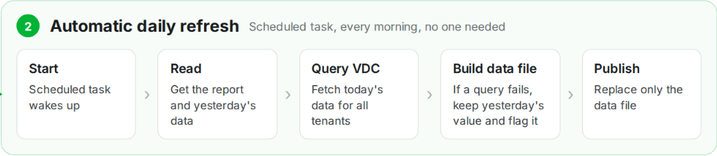
So that takes care of the automatic daily refresh.
But sometimes I am impatient. What if it is the middle of the afternoon and I want the latest numbers right now?
👉 Time for Phase 3: the live refresh button.
3-The on demand live refresh button
With Phase 2, the report is fresh every morning, which is perfect most of the time.
But sometimes I want the latest numbers right now. Maybe a backup just failed, maybe I fixed something five minutes ago, or maybe I am simply too impatient to wait until tomorrow!😅
So Phase 3 adds the magic button: Refresh.
➡️ The idea
The concept is simple: I click "Refresh" in the report, it asks VDC for the latest data, and a few seconds later the dashboard updates itself.
Fresh numbers, on demand. Nice.
➡️ The tricky part
The report is just a web page. By itself, it cannot magically talk to VDC. It does not have access to my MCP connector, and there is absolutely no way I want to hide credentials inside the page like some kind of security Easter egg.
So I need a safe little middleman between the dashboard and VDC.
➡️ The fix
Claude artifacts can ask for special permissions. One of them lets the page use the viewer's own connectors. So the page doesn't hold any credentials. When I click "Refresh", the page asks the Claude app: "can I use this person's VDC connector?"
The first time, I get a small prompt asking me to allow it.
After that, the page calls VDC with my own access, nothing more.
Building the live refresh, step by step
Here’s how I asked Claude to wire everything together and turn that innocent little "Refresh" button into something that actually talks to VDC:
Add a Refresh button to the report that gets live data from
Veeam Data Cloud. To do it properly:

1. Use my own VDC connector through the page's permissions.
   No credentials in the page, and only the read-only tools the
   report needs.

2. Fetch the same data as the daily refresh, with the same
   lessons: times in UTC, and never the tool that returned other
   customers' jobs.

3. If one part fails, keep the old numbers for that part and show
   a clear message in that section. Don't break the whole page.

4. Show the fresh numbers on screen only. Don't save them into
   the report.

5. Make it obvious that a refresh is in progress: turn the button
   green with an animation, and show when the data was last updated.
➡️ What I get
One report, three levels of magic:
- Phase 1 builds it once, carefully and properly.
- Phase 2 wakes up every morning and refreshes it automatically while I enjoy my coffee.
- Phase 3 gives me fresh numbers on demand whenever curiosity, panic, or a failed backup strikes.

So the report stays useful all day, every day, without turning into another dashboard I have to babysit.
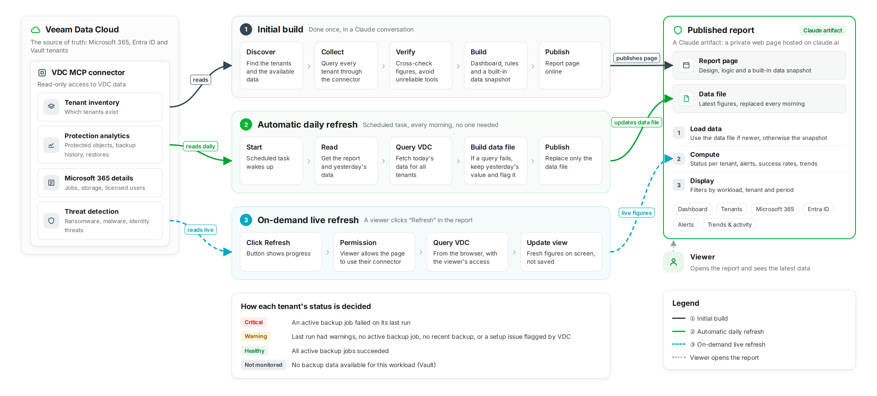
3/ The big picture
Let’s zoom out and look at the whole journey from end to end: VDC exposes the data through the MCP connector, Claude performs the initial build, the scheduled task keeps the Artifact fresh every morning, and the on-demand Refresh button gives us the latest numbers whenever we want them.
One data source, one smart dashboard, three ways to keep it alive.
4/ What is the result?
Here are 4 screenshots showing what the final result looks like in action:
- The summary dashboard, giving you the big picture across all tenants.
- The Microsoft 365 dashboard, focused only on VDC M365 metrics.
- The Entra ID dashboard, dedicated to VDC Entra ID metrics.
- The trends dashboard, showing how key metrics evolve over time.
And as a little bonus for the curious ones, I’ve also included a ZIP file containing the Artifact HTML file and its JSON data file, so you can play with the dashboard yourself using static data.
No MCP required, just unzip and poke around.
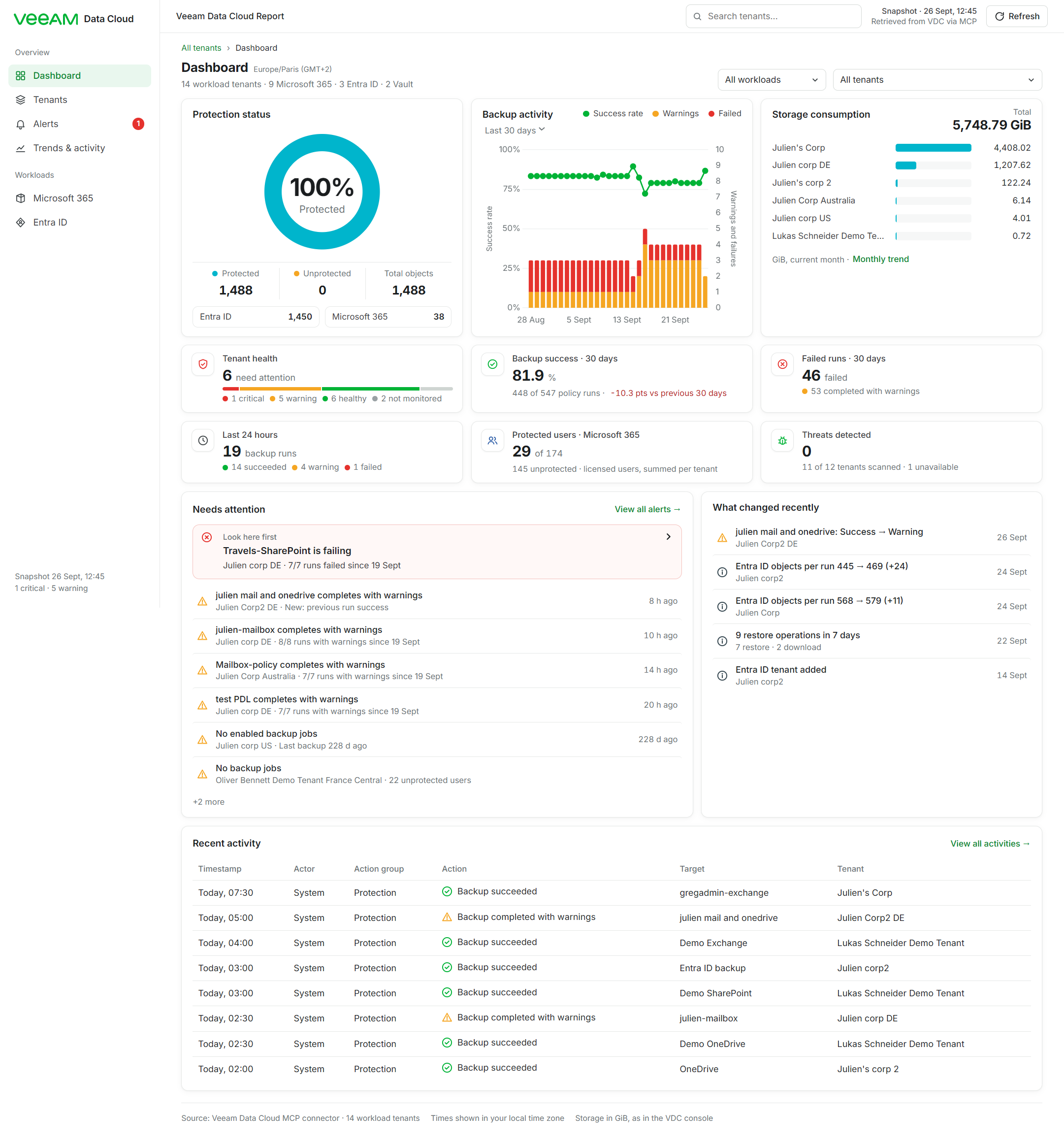
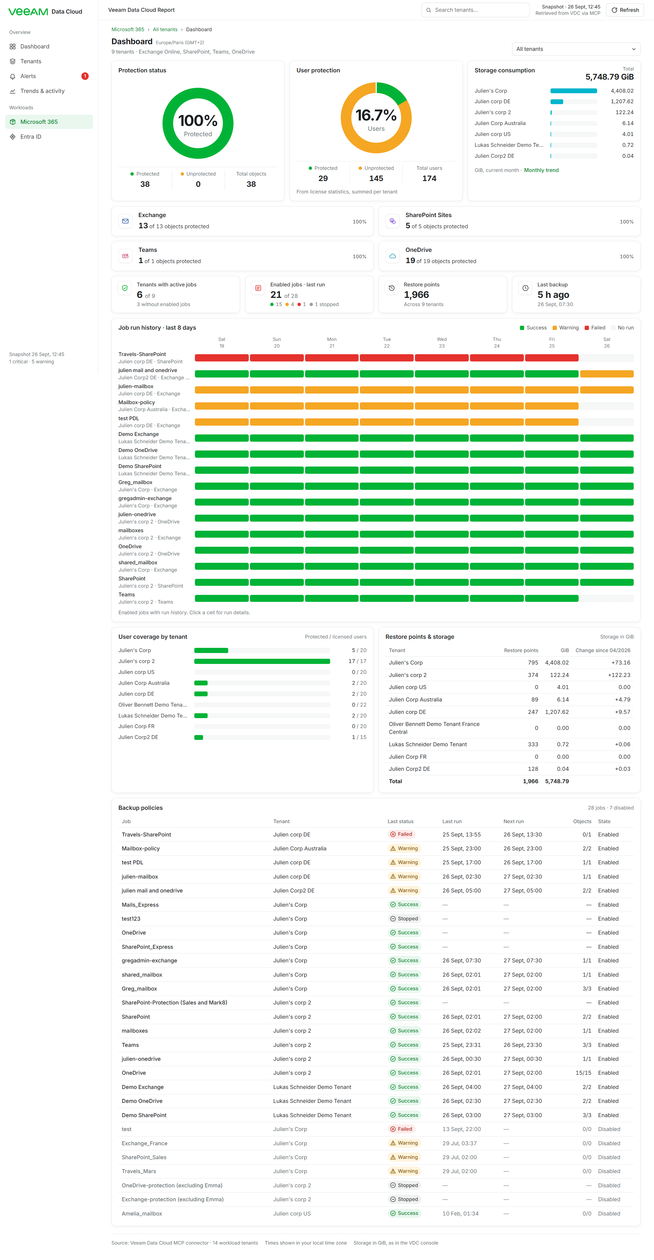
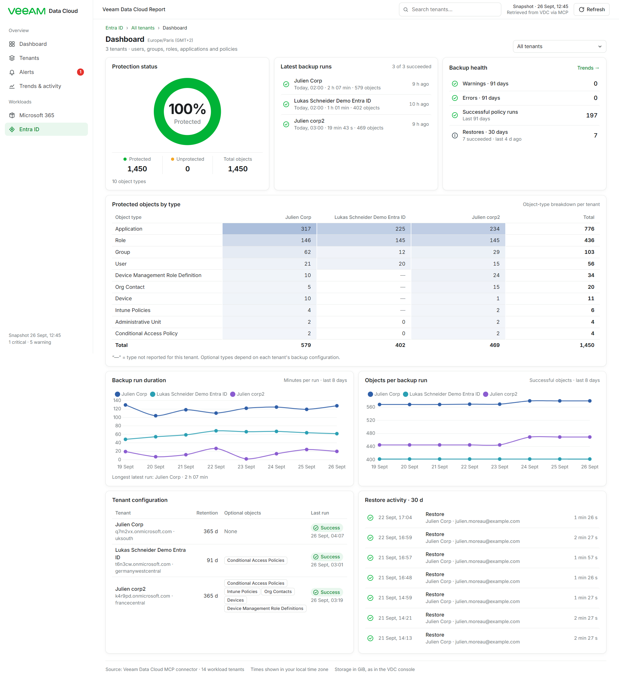
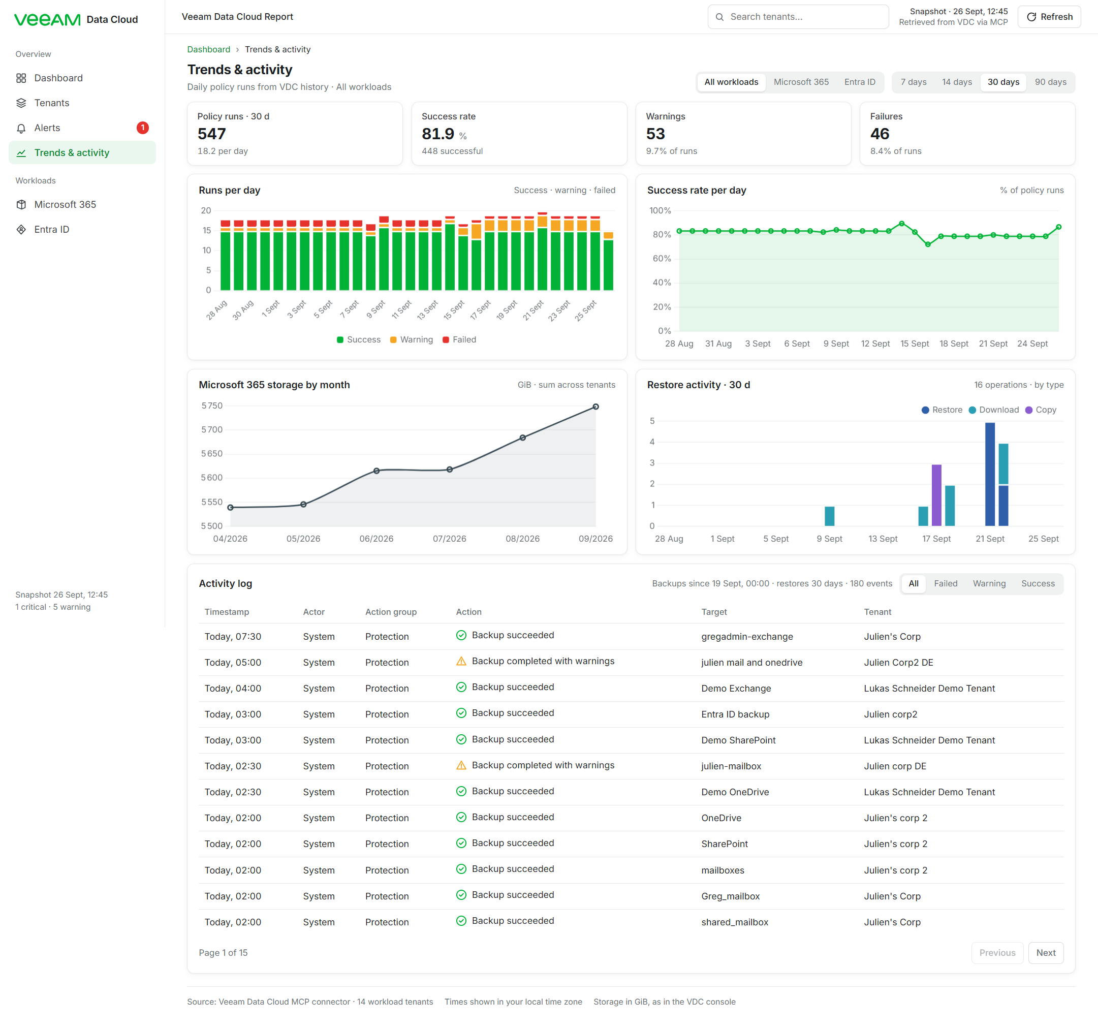
Here’s the ZIP archive containing the Artifact and its dataset
So you can download it, open the dashboard, click around, test the interactions, and have a little fun exploring it yourself. 🎁
5/ Hey Greg, I want the fast track, I don’t have time to go through all the section above!
No worries my friend, I’ve got you! 😎
Open Claude Desktop, start a Cowork session, then simply copy and paste this master prompt.
It should take care of the whole process in one go and get you to the finish line at Mach 2! ⚡
The master prompt for everything in one go:
# Prompt — Veeam Data Cloud Report (ops console + daily refresh)

You are an expert data analyst, UX designer and front-end dashboard developer. Build a complete, interactive **Veeam Data Cloud operations console** as a published Artifact, using the **Veeam Data Cloud (VDC) MCP connector as the only source of truth**. Then set up a **daily scheduled task** that refreshes its data. Work autonomously; ask me only if something is truly blocking.

## 0. Non-negotiable rules

- Every number shown must come from an MCP response or be calculated directly from one (percentages, totals, deltas, rates). Never invent, estimate, extrapolate or use sample data. Never silently replace missing data with zero: show "No data available", "Metric not available" or "Unable to retrieve …".
- If a metric isn't exposed by the connector, don't show it.
- Health statuses must come from VDC or from the deterministic rules in section 5, and the rules must be shown in the UI.
- Show when the data was retrieved. Never imply data is live when it isn't.
- If one dataset fails, only its section shows a small error. The rest of the page keeps working.
- Tell me about any connector anomaly you find, briefly and factually.

## 1. Discovery and data collection

Load the VDC tools with ToolSearch. Use these tools (all read-only):

| Purpose | Tool | Notes |
|---|---|---|
| Tenant inventory | `list_workloads_workloadtenants` | Returns M365, ENTRAID and VAULT workload tenants. `metadata` is a JSON string: parse it. M365 metadata has `tenantId` (= organization UUID for the M365 tools), `m365Name`, `storageRegion`, and `provisioningInfo` (may contain `needAttention: true`, `errorCode`, `errorMessage`). ENTRAID metadata has `domainName`, `protectedObjects`, `protectedUsers`, `recentActivity`, `retentionPolicy`, `optionalBackupObjects`. VAULT metadata has `storageRegion`, `storageAmount`. |
| Protected objects | `query_protected_objects_breakdown_earn` | `{"query":{"time_range":{"start":now−7d,"end":now,"timezone":"UTC"}}}`. One row per tenant × object type, with protected and unprotected counts. |
| Daily history | `query_data_protection_history_earn` | Call it 4 times: `aggregate_by` = `policies` and `objects`, × `filters.workload_types` = `["M365"]` and `["ENTRAID"]`. 91 days, `timezone: "Europe/Paris"`, start = local midnight 90 days ago, end = local midnight tomorrow. One row per day with successes, warnings and errors. |
| Backup runs (audit) | `query_audit_protection_history_earn` | Last 8 days, `sort_by:"timestamp"`, `sort_order:"desc"`, `limit:100`, and follow `pagination.nextCursor` while `hasNext`. **Always use `timezone:"UTC"`**: with `Europe/Paris` the service returns timestamps 2 h late (verified against the same run queried in UTC and against the M365 job API). Each row has `policy_id`, `tenant_id`, `status`, `start_time`, `end_time` and `obj_type_stats` (successful, warning, failed, rpo_compliant). |
| Restores | `query_audit_restore_history_earn` | Last 91 days, `timezone:"UTC"`, with pagination. Types: RESTORE, DOWNLOAD, COPY, EXPORT. Statuses include SUCCESS, ABORTED and STARTED (`end_time` null). |
| M365 jobs | `get_all_backup_jobs_for_org_m365` | Pass `workload_tenant_id`, `organization_uuid` (from metadata `tenantId`) and `page_size:100`. **Never use `list_backup_jobs_m365`**: it returns jobs belonging to other organizations on the same VBO instance (data-isolation issue, not org-scoped). The job `id` equals the audit `policy_id`, which gives the policy name. |
| M365 stats | `get_backup_statistics_m365` | `lastBackup`, `status`, `restorePoints`, `hasEntireBackup`, and `storageUsage` = monthly `[{key:"MM/YYYY", value}]`. **The unit is GiB**: it matches the "Storage Consumption" figure in the VDC console. |
| M365 licenses | `get_licenses_statistic_m365` | `protectedUsers`, `unprotectedUsers`, `inactiveUsers`. |
| Threats | `fetch_m365_threats_threatdetection`, `fetch_entraid_threats_threatdetection` | `limit:100`. It may return 404 for a tenant: record it as "Threat detection unavailable" (informational). |
| Session drill-down (optional) | `get_backup_job_sessions_m365`, `get_backup_session_logs_m365` | Sessions work (status, processedObjects, transferredDataBytes). The logs call returned HTTP 500 in earlier tests. Only show a log view if it works now. |

Known pitfalls:
- **Do not use `get_storage_used_statistic_m365` totals.** It returns the same total for every regional tenant of one M365 organization, and a single user's value can exceed the "total". Use the `storageUsage` from `get_backup_statistics_m365` instead.
- Vault tenants expose no backup metrics currently through MCP: mark them "Not monitored".

## 2. Artifact: format, stack, publishing

- One self-contained HTML page with `<title>Veeam Data Cloud Report</title>`. Chart.js 4.4.1 UMD from `https://cdn.jsdelivr.net/npm/chart.js@4.4.1/dist/chart.umd.js`. Fonts from Google Fonts: **Inter** (400/500/600/700) and Roboto Mono.
- The Veeam logo, top-left: use the official wordmark path from the `simple-icons` npm package (`icons/veeam.svg`: `npm pack simple-icons`). Fill it `#00b336`, cropped with `viewBox="0 9.6 24 4.8"`, followed by the text "Data Cloud".
- Light theme only, with a white dominant background and an explicit background colour on `body`.
- **Data architecture:**
  - Embed a snapshot of the collected data in the page (so it works without the connector). Keep it compact: run-length-encoded daily history and one line per run.
  - Normalize everything into one in-memory `RAW` object with the same schema as `data.json` (section 9).
  - A `derive(RAW)` function computes everything the UI shows. Renderers read only from `derive`.
  - On load, `fetch("data.json", {cache:"no-store"})`. If it is valid (`tenants` non-empty, `asOf` present) and newer than the embedded snapshot, replace `RAW` and re-render. On any failure, keep the snapshot.
  - Publish `data.json` as a supporting file (`files: {"data.json": path}`).
- **Live refresh button** (top bar) through the page's `mcp` runtime capability. Load the `artifact-capabilities` skill first and read its `mcp.d.ts`.
  - Declare `capabilities: {mcp: {servers: [{server: "VDC-mcp", tools: [list_workloads_workloadtenants, query_protected_objects_breakdown_earn, query_data_protection_history_earn, query_audit_protection_history_earn, query_audit_restore_history_earn, get_all_backup_jobs_for_org_m365, get_backup_statistics_m365, get_licenses_statistic_m365, fetch_m365_threats_threatdetection, fetch_entraid_threats_threatdetection]}]}}`.
  - `const mcp = await claude.use("mcp")`. If it is null, show a toast "Live refresh isn't available in this view".
  - Call tools with `mcp.callTool(server, tool, input, {cache:false})`. Unwrap `result.payload` (it may be a string to JSON-parse), then take `.data`. Treat `success:false` as an error.
  - Run all calls in parallel, isolating failures per section (keep the last good data and set `errors[section]`).
  - Branch the error copy on error codes: `server_not_connected`, `needs_reauth`, `not_in_manifest`, `server_unavailable`, `consent_required`, etc.
  - **While refreshing, the button turns green:** green border, light-green background, spinning icon, the label "Refreshing…", and a thin green bar sliding along its bottom edge. A 3 px progress bar under the top bar fills as calls complete.
- Charts: set `Chart.defaults.animation = false`. Legends use round point styles. Axes and gridlines are faint (`#eef1f0`).
- Take one screenshot look before publishing (Playwright). Pass `icon: "shield"` on first publish.
- Deep links: `#overview`, `#tenants`, `#m365`, `#entra`, `#alerts`, `#trends`.
- Time: show all times in the viewer's local time zone. Show the time zone next to page titles as the IANA name, e.g. "Europe/Paris (GMT+2)". Relative times ("18 min ago", "Today, 07:30", "Yesterday, 02:00") are computed against the data's `asOf`, never against `Date.now()`.

## 3. Visual design (VDC console style)

Model it on the real Veeam Data Cloud console.

- **Tokens:**
  - Colours: bg `#ffffff`; panel `#f6f7f7`; hover `#f3f6f4`; line `#e6e8e7`; line-2 `#d6dad8`; ink `#1a1d1f`; ink-2 `#3c4245`; muted `#6b7275`.
  - Green (Veeam) `#00b336`, text green `#00852b`, tint `#e9f7ee`. Amber `#f5a623` (text `#8a5a00`, tint `#fff4de`). Red `#e5322d` (text `#b42318`, tint `#fdeceb`). Unknown `#9aa1a4`. Cyan `#00b5cc` for protection donuts, coverage bars and storage bars. Slate `#34464f`.
  - Card radius 10 px. Shadow `0 1px 2px rgba(16,24,20,.04), 0 2px 8px rgba(16,24,20,.04)`.
- **Status colours are reserved:** green for healthy/success, amber for warning, red for critical/failed. Never use them decoratively.
- **Status icons are outline style,** 16 px: circle-check (green), triangle with "!" (amber), circle-x (red), circle-dash (unknown), circle-i (info, slate). Pills are small rounded chips with a tinted background, an icon and a label.
- **No coloured accent bar on the left side of cards or alerts.** All cards and alert cards have a plain 1 px grey border.
- **Layout shell:**
  - Left sidebar (236 px, white, right border). At the top, the Veeam wordmark and "Data Cloud".
  - Group "Overview": Dashboard, Tenants, Alerts (with a red count badge for critical alerts), Trends & activity.
  - Group "Workloads": Microsoft 365, Entra ID.
  - Each nav item has a line icon. The selected item has a light-green background and green text.
  - Bottom of the sidebar: small text with the snapshot time and critical/warning counts.
  - Sticky top bar (48 px): the context text "Veeam Data Cloud Report"; a search box ("Search tenants…"; Enter opens Tenants filtered); the freshness text ("Snapshot · 26 Sept, 12:45 / Retrieved from VDC via MCP", or "Daily refresh …", or "Live data …"); and the Refresh button.
  - Below 900 px the sidebar becomes a horizontal bar. No horizontal page scroll at 400 px; tables scroll inside their own container.
- **Page header:** green breadcrumbs (e.g. "All tenants › Dashboard"; "Microsoft 365 › Greg's corp 2 › Dashboard"), a bold title (19 px, 700) with the small grey time-zone caption, a grey subtitle, and filters on the right.
- **Controls:**
  - Dropdowns: custom chevron, `appearance:none`, 1 px border, 7 px radius.
  - Segmented tabs: grey `#f0f2f1` container, the selected tab white with a small shadow.
  - Period pickers are a plain text dropdown ("Last 30 days ▾").
- **Compact density:**
  - Base font 13 px. Grid gap 12 px. Card padding 13 px 16 px. Card titles 14 px, 600.
  - KPI values 22 px, 700. Table cells 7 px 8 px (mini tables 5 px 8 px). List rows 7 px.
  - Charts about 210 px tall. Icon tiles 34 px (a bordered square with an 18 px line icon).
- **Donut cards ("ring cards"),** used for Protection status and User protection:
  - A large centred donut (width `clamp(140px, 52%, 188px)`, stroke 19 on r = 54 in a 140 viewBox).
  - Protected arc in cyan on the dashboard and green on workload pages. Unprotected remainder in amber. Grey track when there is no data.
  - Bold percentage (27 px, 700) and the label inside the ring.
  - Below the ring, a 3-column stats row separated by a top border and vertical dividers: "● Protected N", "● Unprotected N", "Total objects/users N".
  - Optional footer at the bottom of the card (buttons or a note). The card fills its grid row height without large empty gaps.
- **KPI tiles:** an icon tile on the left; a label (12.5 px, 500); a big value with a small grey unit; an optional mini bar (6 px) or health strip; a footer line with coloured dots. Clickable tiles go to the relevant page.
- **Charts:**
  - The "Backup activity" combo chart: a green line with dots for the success rate (left axis 0–100 %, titled "Success rate"), plus stacked amber (warnings) and red (failed) bars on a right axis titled "Warnings and failures" (suggested max = 2 × the daily max, at least 4).
  - x labels: weekday (Sun, Mon…) when ≤ 14 days, otherwise "20 Sept". The legend is a small row of round dots in the card header. Clicking the chart opens Trends.
- **Equal-width table columns:** use `table-layout:fixed` with a colgroup where the label column is fixed (e.g. 280 px) and all value columns share the rest equally. Numbers are right-aligned with tabular figures and ~14 px right padding. Headers wrap inside their column.

## 4. Pages

**Dashboard** (default view; default period **30 days**; period options 7 / 14 / 30 / 90 days)
- Header filters: **All workloads / Microsoft 365 / Entra ID** dropdown and **All tenants** dropdown (the tenant list follows the workload; Vaults excluded), plus a Reset link. Filters apply to every card. Breadcrumb and subtitle reflect the selection.
- Row 1 (3 columns):
  - (a) Protection status ring card (cyan), with footer buttons "Entra ID 1,450" and "Microsoft 365 38" linking to the workload pages.
  - (b) Backup activity combo chart with the period dropdown. For a single tenant, use that tenant's own runs over the last 8 days, labelled "Last 8 days · tenant run log" (VDC history is only available per workload).
  - (c) Storage consumption: "Total 5,748.79 GiB" top-right and cyan horizontal bars for the top 6 tenants (GiB, current month), with a "Monthly trend" link. For a single M365 tenant, show its monthly values instead. Hide the card if no M365 tenant is in scope.
- Row 2: 6 tiles.
  - Tenant health: count needing attention, a health strip, and dots for critical / warning / healthy / not monitored.
  - Backup success % for the period: bar, "N of M policy runs", and the delta in points vs the previous period.
  - Failed runs for the period, plus warnings.
  - Last 24 hours: runs split into succeeded / warning / failed.
  - Protected users · Microsoft 365 (cyan bar, "summed per tenant"). For an Entra-only scope, show "Protected users · Entra ID" from the User object count instead.
  - Threats detected: "N of M tenants scanned · K unavailable".
- Row 3:
  - "Needs attention": a highlighted "Look here first" box for the top alert, then the next alerts, with "View all alerts →".
  - "What changed recently" (see 5).
- Row 4: "Recent activity" table (8 rows) with Timestamp ("Today, 07:30"), Actor, Action group, Action (with a status icon), Target, and Tenant. "View all activities →" goes to the Trends activity log.

**Tenants**
- Search box, workload segmented filter (All / M365 / Entra ID / Vault), status filter (Any / Critical / Warning / Healthy), Reset.
- Table sorted by severity, with columns:
  - Tenant (name + domain · region)
  - Workload chip
  - Status pill + reason
  - Last backup (relative + date)
  - Runs · 7 d (green/amber/red dot counts)
  - Protected objects
  - Jobs (enabled / total, or "1 policy" for Entra)
- The status rules are shown under the table. A row click opens the tenant drawer.

**Microsoft 365** (tenant dropdown; breadcrumb "Microsoft 365 › <tenant or All tenants> › Dashboard")
- Row 1: Protection status ring card (green), User protection ring card (licensed users, note "From license statistics"), and Storage consumption (GiB).
- Row 2: 4 service cards in a 2×2 grid: Exchange, SharePoint Sites, Teams, OneDrive.
  - Each card has a bordered icon tile (generic line icons, not Microsoft logos; colours Exchange `#2f5fa8`, OneDrive `#2a9fb3`, SharePoint `#8a5cd0`, Teams `#d0578a`) and "**N** of N objects protected".
  - It also has a green progress bar with the %, or "No protected objects reported" in italics.
  - Clicking a card filters the job matrix to that service.
- Row 3: tiles for Tenants with active jobs, Enabled jobs · last run (dot counts incl. "stopped"), Restore points, and Last backup.
- Job run history matrix for the last 8 days:
  - One row per enabled job with run history (job name + tenant · service); one cell per day in green, amber, red, or dashed grey for "no run".
  - Cells are clickable and open the run drawer; tooltips show time, status and duration.
- User coverage by tenant (green bars, "p / total").
- Restore points & storage table: Tenant, Restore points, GiB, and "Change since 04/2026" as an absolute GiB delta, plus a total row.
- "Backup policies" table: all jobs including disabled ones, greyed out.

**Entra ID** (tenant dropdown)
- Row 1:
  - Protection status ring card, with a note on the number of object types.
  - "Latest backup runs": one row per tenant with status icon, "Today, 02:00 · 2 h 07 min · 579 objects", and relative time.
  - "Backup health": warnings over 91 days, errors over 91 days, successful policy runs, and restores over 30 days.
- "Protected objects by type": a heat table of object types × tenants plus Total. Equal-width columns. Blue intensity `rgba(47,95,168, 0.06 + 0.34·v/max)`. "—" when a type isn't reported, with a note explaining that.
- Two line charts over the last 8 days (one line per tenant): Backup run duration (minutes) and Objects per backup run.
- Tenant configuration table: tenant + domain · region, retention in days, optional-object chips, and last run (pill + time).
- Restore activity over 30 days.

**Alerts**
- Severity segmented filter with counts (All / Critical / Warning / Info), tenant filter, Reset.
- Sections Critical, Warning and Informational, then a Healthy list of tenant buttons and the threat summary.
- Each alert is an expandable `<details>` card. The summary shows icon, title, tenant · workload, metric and relative time. The body shows facts (service, objects processed, last run, next run with "in 45 min"), any note, a recent-runs table (start, status, duration, objects OK, RPO-compliant), an "Open tenant" button and the rule that produced the alert.
- Clicking an alert anywhere opens this page with that alert expanded.

**Trends & activity**
- Workload segmented filter (All / Microsoft 365 / Entra ID) and period segmented filter (7/14/30/90).
- KPI tiles: policy runs, success rate, warnings, failures.
- Charts:
  - runs per day, stacked success/warning/failed bars;
  - success rate per day, a green area line from 0 to 100 %;
  - Microsoft 365 storage by month (GiB, with a per-tenant tooltip);
  - restore activity over 30 days, stacked by type.
- "Activity log": backup runs and restores in one list with a status filter, 12 rows per page, and a pager. Clicking a row opens the drawer.

**Drawers** (right side panel, scrim, Esc to close)
- Tenant drawer:
  - Facts: region, status, created, M365 organization, storage region, restore points, last backup, users protected, inactive users, entire-org backup, threats; for Entra, domain, retention and objects.
  - Status reasons and alerts.
  - For M365: jobs table with last status, an "8 dots" run history and next run, protected objects bars, and a monthly storage bar chart (GiB).
  - For Entra: the runs table and object-type bars.
  - Restores over 30 days, and identifiers in monospace.
- Run drawer: tenant, workload, start, end, duration, successful objects, RPO-compliant objects, object types, job state and next run; any note; and the recent runs of the same job, with the current run highlighted.

## 5. Rules (deterministic, shown in the UI)

**Tenant status:**
- M365: **Critical** if any enabled job's last status is Failed. **Warning** if any enabled job's last status is Warning, if there are no jobs, if no job is enabled, or if `provisioningInfo.needAttention` is true. Otherwise **Healthy**. "Stopped" is ignored for health.
- Entra ID: Critical if the last run failed; Warning if it warned or there has been no backup for 48 h; otherwise Healthy.
- Vault: **Not monitored**.

**Alerts:**
- Critical: an enabled job whose last run failed. The metric is the streak, e.g. "7/7 runs failed since 19 Sept".
- Warning:
  - an enabled job whose last run warned ("8/8 runs with warnings since 19 Sept", or "New: previous run success" when it just flipped);
  - no backup jobs;
  - no enabled jobs ("Last backup 228 d ago");
  - provisioning flagged, showing the VDC error message;
  - Entra ID failures or staleness.
- Info:
  - enabled jobs in the Stopped state;
  - disabled jobs whose last run failed or warned;
  - threat API unavailable;
  - users outside backup scope (unprotected licensed users in tenants with active jobs);
  - Vault tenants not monitored.
- Any threat count > 0 is Critical.
- For warning runs with 0 objects processed, add the note "Latest run processed 0 objects; N objects still RPO-compliant".

**What changed recently:**
- The latest status change per policy (e.g. "greg mail and onedrive: Success → Warning").
- Entra object-count changes across the run window (e.g. "Entra ID objects per run 445 → 469 (+24)").
- Tenants created in the last 30 days.
- "N restore operations in 7 days" with a breakdown by type.

**Rates:** success rate = successes ÷ (successes + warnings + errors) from the daily policy history. Object-level history is used only where it is labelled as objects.

## 6. data.json schema (also the in-memory RAW)

```json
{
 "asOf": "ISO UTC",
 "tenants": [{"id","type","name","region","status","created","meta":{}}],
 "jobs": {"<workloadTenantId>": [{"id","name","enabled","last","lastRun","nextRun","total","processed","backupType"}]},
 "stats": {"<id>": {"lastBackup","status","restorePoints","hasEntireBackup","storage":[{"k":"MM/YYYY","v":GiB}]}},
 "lic": {"<id>": {"p","u","i"}},
 "threats": {"<id>": {"total":n} | {"error":"msg"}},
 "breakdown": [{"t","wl","type","p","u"}],
 "hist": {"M365":[{"d":"YYYY-MM-DD","s","w","e"}], "ENTRAID":[...]},
 "histObj": {"M365":[...], "ENTRAID":[...]},
 "runs": [{"t","p","st":"S|W|F","s":"ISO","e":"ISO","n","w","f","rc","types":"Exchange,OneDriveBusiness | Entra ID objects"}],
 "runWindowStart": "ISO",
 "restores": [{"t","wl","type","s","e"|null,"actor","st"}],
 "notes": {"<policyId>": "text"},
 "errors": {"<section>": "Unable to retrieve …"}
}
```

## 7. Scheduled task (daily refresh)

After publishing, create a **scheduled task** (not a local cron). Settings:
- **Name:** "VDC report daily refresh".
- **Cron:** `CRON_TZ=Europe/Paris 53 9 * * *` (runs at 09:53 so data is fresh before 10:00).
- Cloud only (no local device). Leave the permission mode unset.

Its prompt must be fully standalone and contain the new artifact URL:

> Refresh the data of the "Veeam Data Cloud Report" artifact at `<ARTIFACT_URL>` with fresh data from the VDC MCP connector (`mcp__VDC-mcp__*`, load with ToolSearch). Only replace the supporting file `data.json`. Never change the page HTML, never invent or estimate values, never fill gaps with zeros.
>
> 1. **Read.** Artifact `read` of the url, and note the saved page file path. Artifact `read` with path `data.json` to get the previous data (fallback).
> 2. **Query.** Save each response's `data` to raw/*.json as you go.
>    - `list_workloads_workloadtenants`. If it fails or the connector is missing: STOP, don't publish, report.
>    - Breakdown over the last 7 d (UTC).
>    - `query_data_protection_history_earn`: policies + objects × M365 + ENTRAID, 91 days, Europe/Paris.
>    - `query_audit_protection_history_earn`: last 8 d, **timezone UTC** (Europe/Paris shifts times 2 h), limit 100, with pagination.
>    - `query_audit_restore_history_earn`: last 91 d, UTC, with pagination.
>    - Per M365 tenant (org = metadata.tenantId): `get_all_backup_jobs_for_org_m365` (page_size 100), `get_backup_statistics_m365`, `get_licenses_statistic_m365`, `fetch_m365_threats_threatdetection`.
>    - Per Entra ID tenant: `fetch_entraid_threats_threatdetection`.
>    - Never use `list_backup_jobs_m365`.
> 3. **Build.** Build data.json with a script in the schema above. Runs keep SUCCESS/WARNING/FAILED rows with both times; `n`/`w`/`f`/`rc` are sums over obj_type_stats; types = "Entra ID objects" for ENTRAID, else the object types joined with ",".
>    - If a call fails, reuse that section (or tenant entry) from the previous data.json and set `errors[section]` = "Unable to retrieve …".
>    - Validate: JSON parses, tenants is non-empty, every M365 tenant has jobs/stats/lic, hist arrays have 80–92 rows, run times are ISO, asOf is newer.
> 4. **Publish.** Artifact publish with url=`<ARTIFACT_URL>`, file_path = the saved page, files = {"data.json": new file}, label "Daily refresh <date>". Don't pass capabilities, icon or contract. On a conflict, re-read and publish once more.
> 5. **Report** in 3–5 lines: tenants, tenants with failing or warning enabled jobs, 7-day success rate, and sections not refreshed.

Tell me the setting it got (automatic approval or not) and the next run time.

## 8. Final quality check before handing over

- Cross-check key numbers against the raw responses: protected objects, users, restore points, 7-day and 30-day success rates, the last 24 h run count, and alert counts.
- Check that every clickable element does something and that the filters change what's shown.
- Check there's no horizontal scroll at 400 px, the charts are readable, and there are no empty oversized cards.
- Hand over in a few lines: what the page is, the top findings (the tenants needing attention), the connector anomalies found, and the scheduled task.
Ouch! That was my big baby prompt! 😅
6/ So, what do this mean?
Ok guys, this was just one example of what MCP + LLM can bring to the table, but in my opinion, this is a real game changer.
I built this interactive dashboard in just a few hours. With the old-school approach of scripts, API calls, data formatting, HTML, authentication, debugging, and a generous amount of coffee, this would probably have taken me weeks.
(But I don’t want to be too harsh on the old-school approach either. It still has plenty of advantages, and we’ll give it some well-deserved love in another blog post)
And this is where things get really interesting: the possibilities are almost endless.
I could build a dashboard focused only on backup operations for the backup admin team. Or a completely different one for the security team, centered around threat detection, suspicious activity, and critical alerts.
Then why stop at dashboards? The same workflow could generate a nice HTML email containing only critical alerts and send it to the backup administrators group when Claude find Critical events from the grabbed metrics. Or produce a clean JSON payload and push the data into Splunk, Grafana, ServiceNow, or whatever hungry system is waiting on the other side.
Same MCP data. Same LLM. Completely different outputs depending on who needs the information and how they want to consume it.
This is the part I really love: once the plumbing is there, the limit is no longer the API or the scripting language. It is mostly how far you want to push the idea.
Alright, enough blog writing for tonight, my dear tech aficionados!
My brain is now running on low battery, I need to grab a few hours of sleep before the family wakes up fully charged! 😴
I hope you found this little adventure interesting, useful, or at least gave you a few new ideas to play with.
For me, it is yet another reminder of how these new AI tools are completely changing the playground. Not just by answering questions, but by opening the door to new workflows, automations, dashboards, integrations, and all those crazy little ideas that start with “Hmm... what if I tried this?”
So keep experimenting, keep breaking things in the lab, keep learning, and never walk past an IT rabbit hole without at least having a quick look inside.
We all know that “quick look” will probably cost you the entire weekend anyway. 😎🐇
Have tech, have fun, and see you in the next adventure! ❤️